Ensemble Resonanz. Spielzeit 25/26
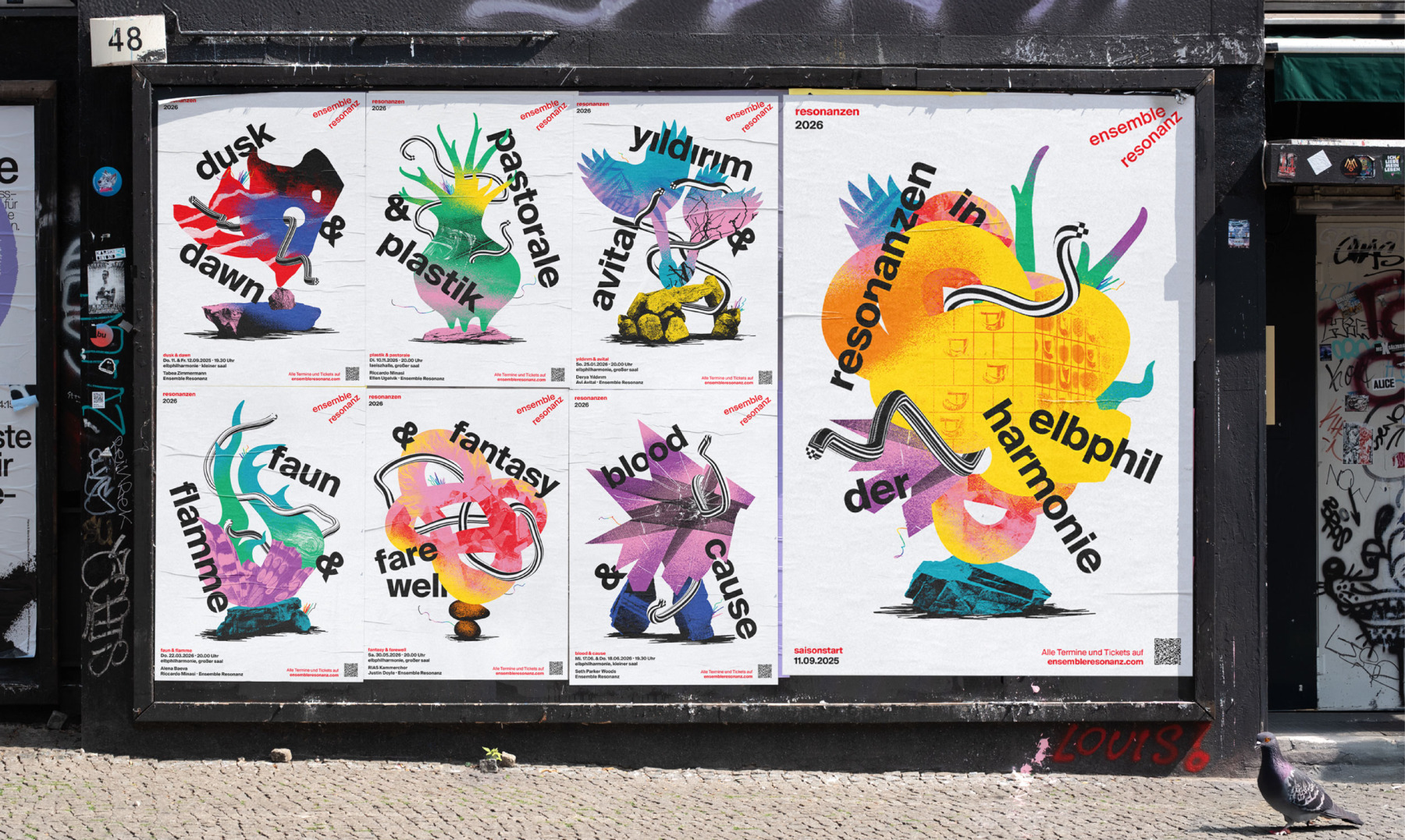
Für das Ensemble Resonanz haben wir die Spielzeit 25/26 in eine Plakatserie verwandelt, die schon auf der Straße klingt, bevor der erste Ton im Saal ankommt. Als Designagentur aus Hamburg verantworten wir Branding, Kampagnendesign und Spielzeitmotive – mit klarer Markenstrategie und viel Farbe gegen die übliche Tristesse im Stadtraum. Die lebendige Palette sorgt für Visibility und Brand Awareness, ohne die charakteristische Schärfe des Ensembles zu verlieren.
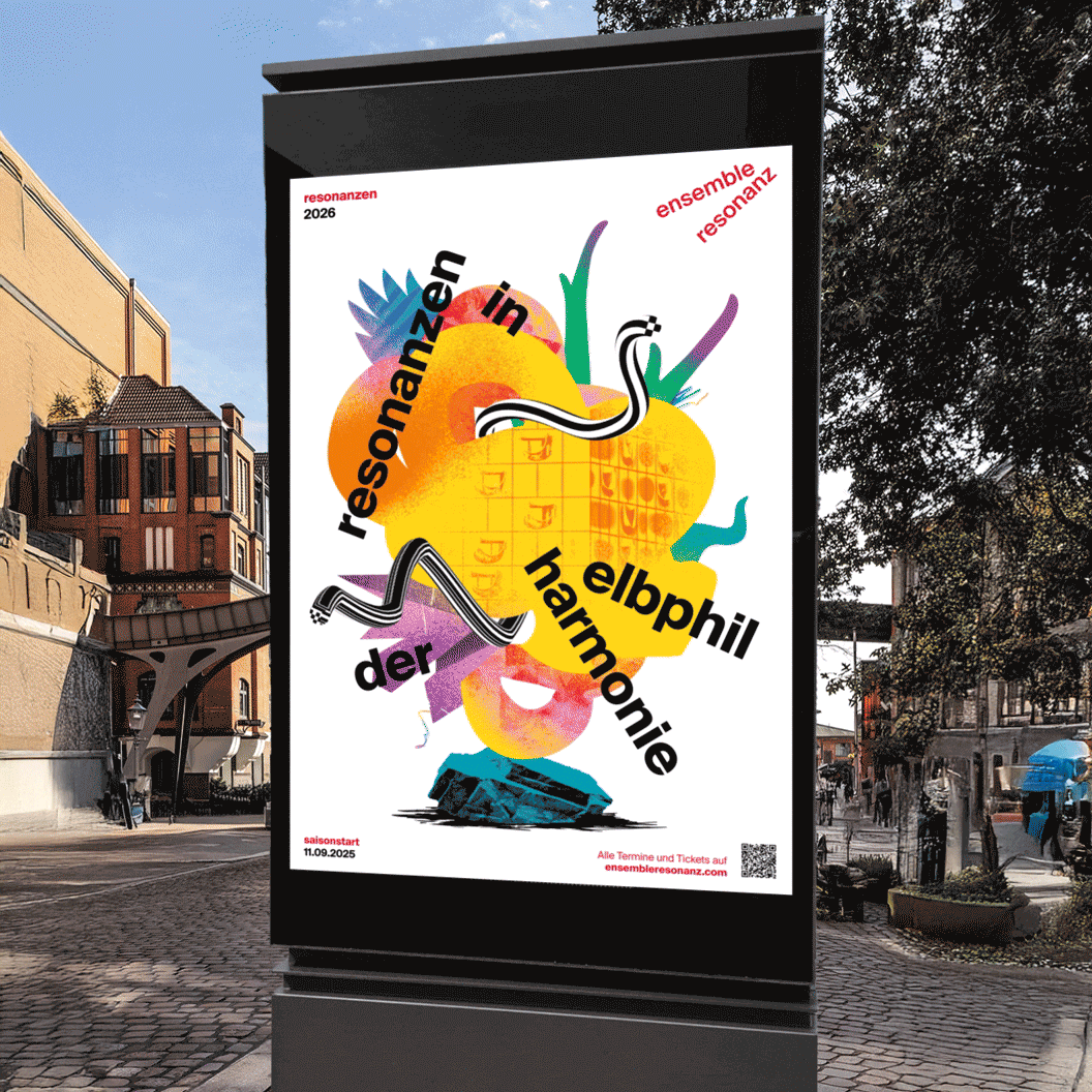
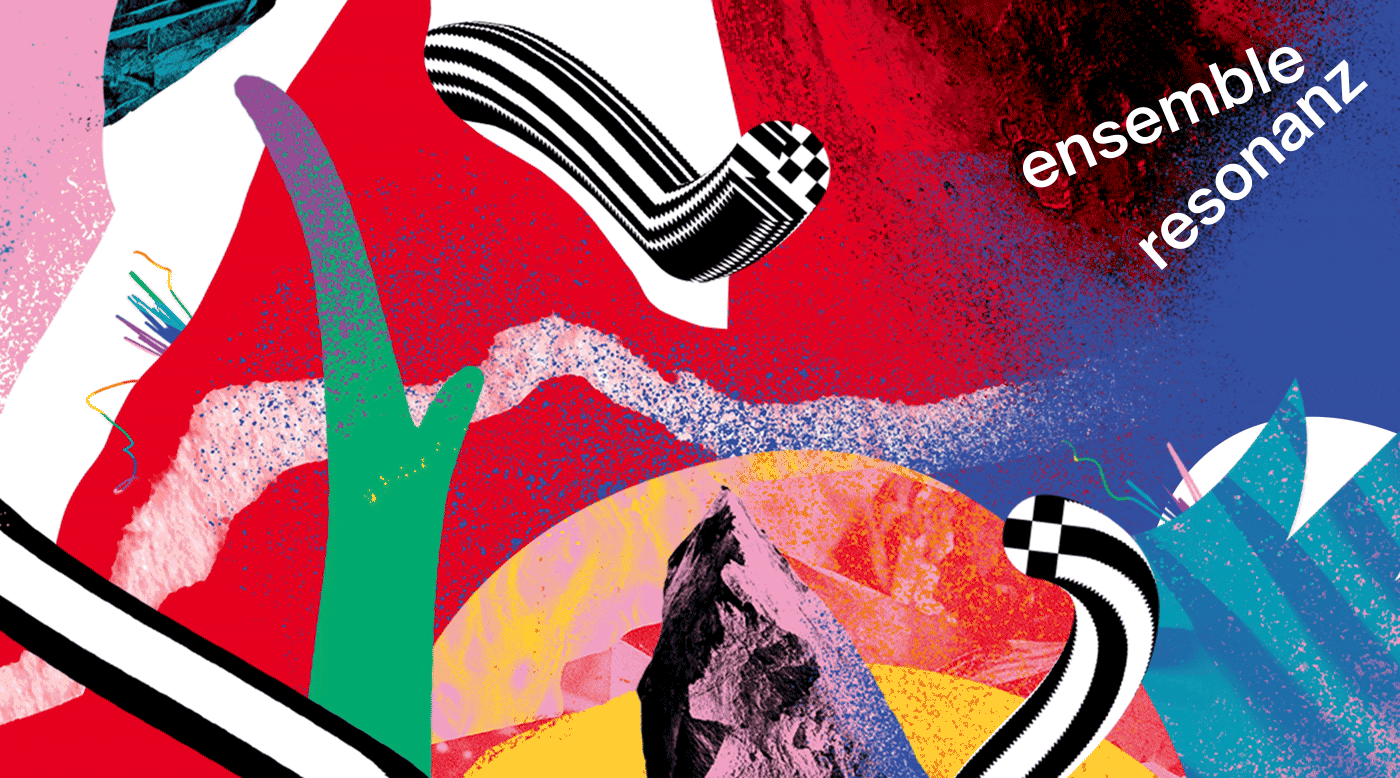
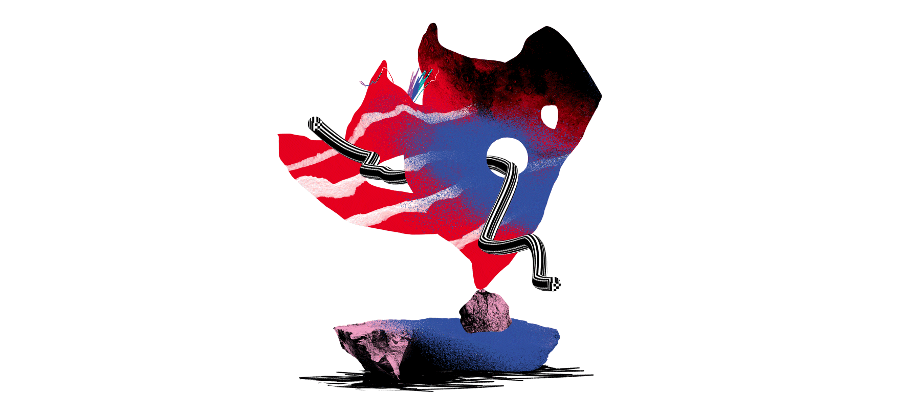
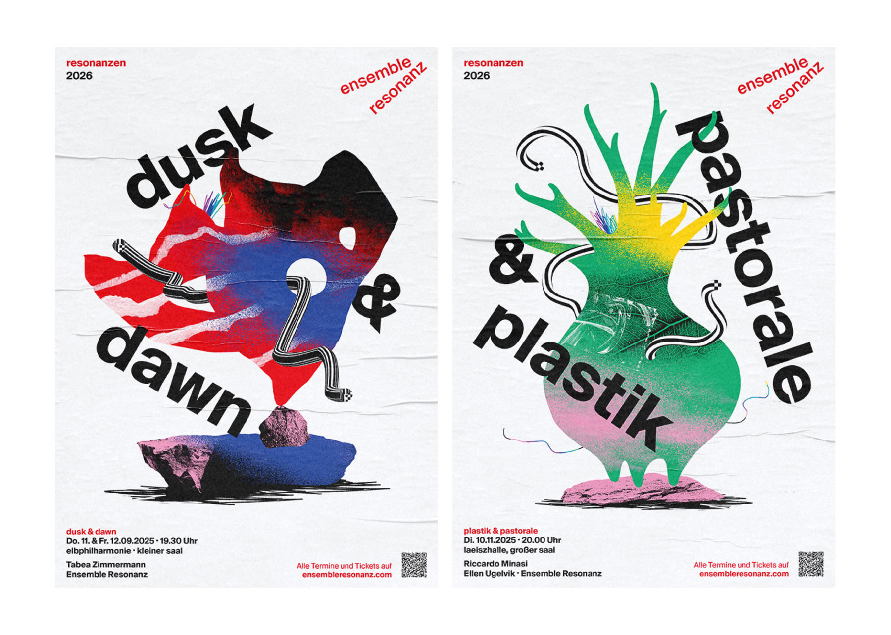
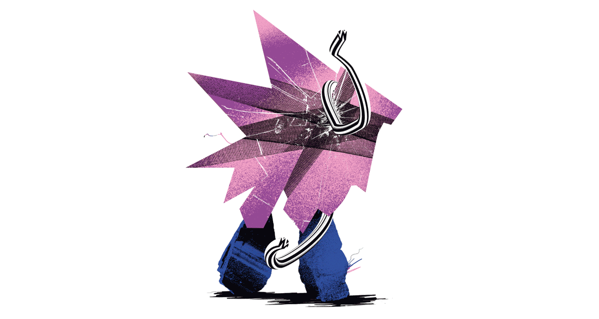
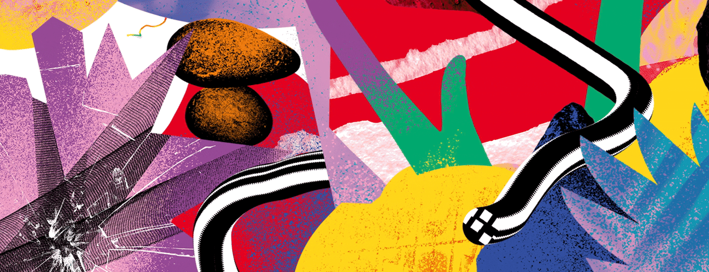
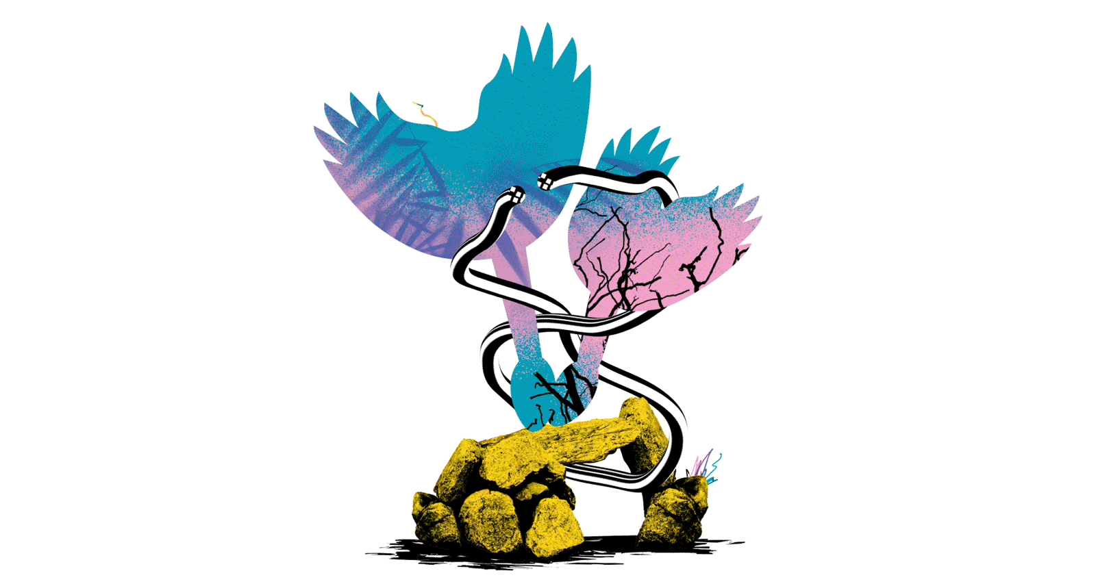
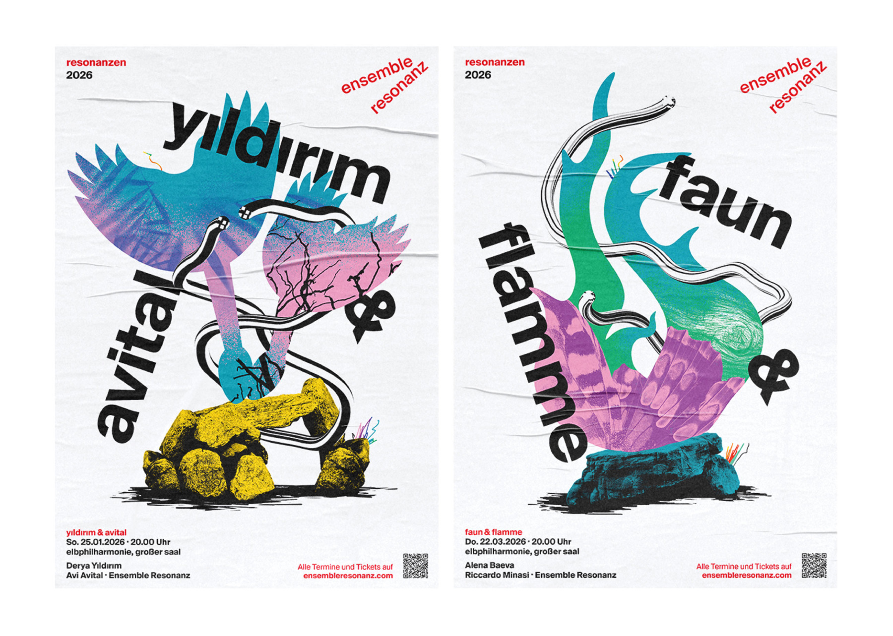
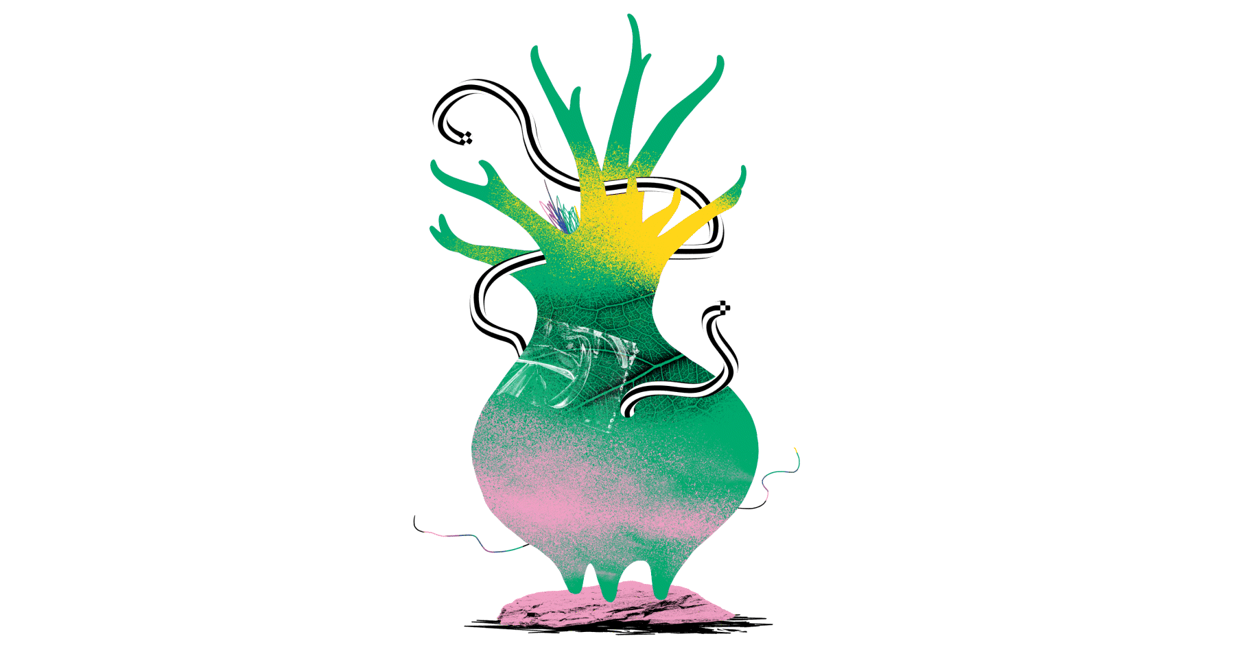
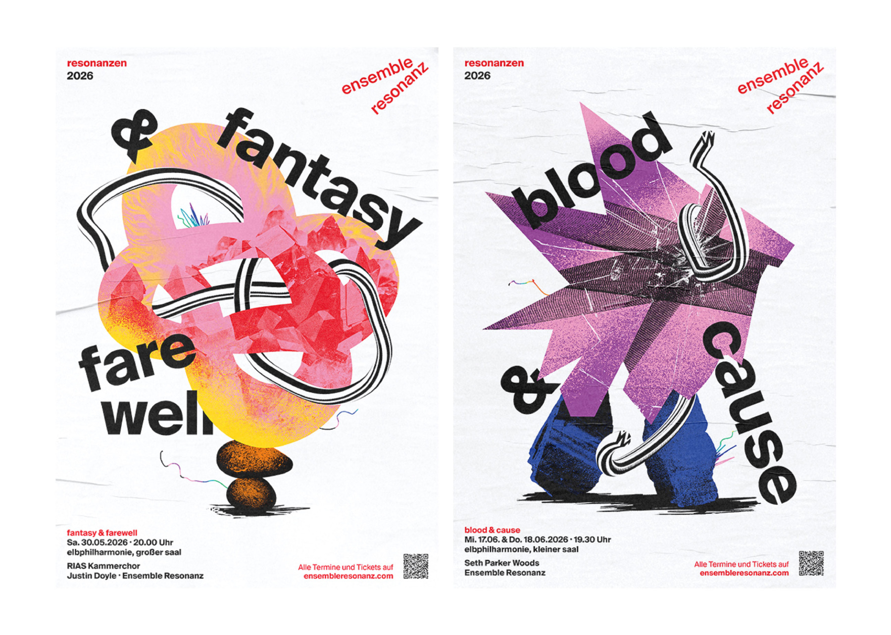
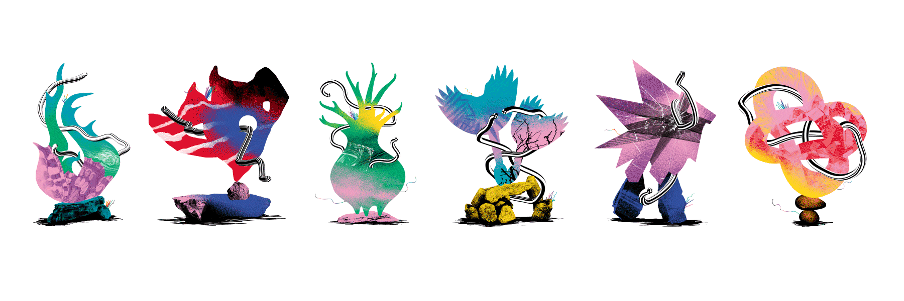
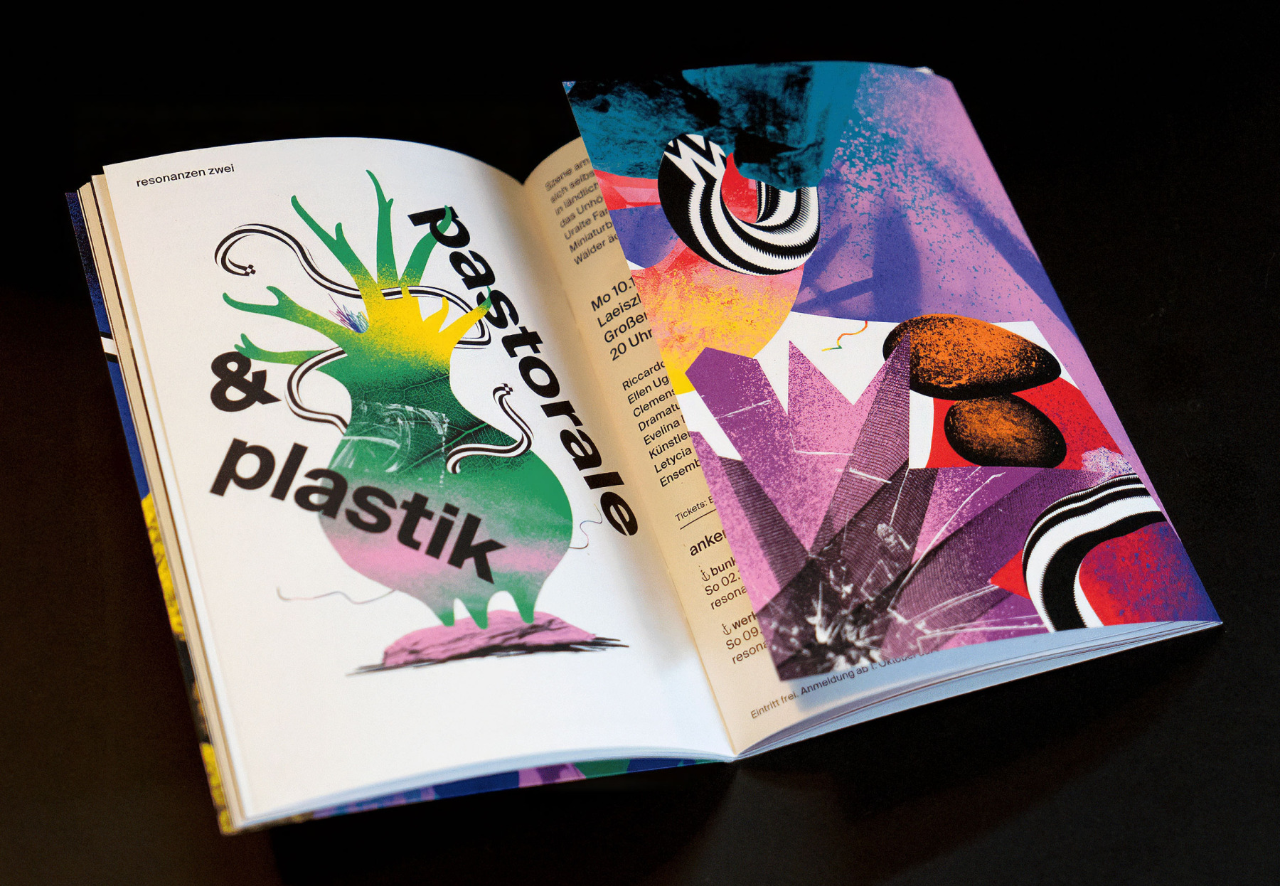
Gestalterischer Kern ist das Spannungsfeld zwischen Bruch und Verbindung: collageartige Monumente aus abstrakten und organischen Formen, die jedes Konzertthema spiegeln. Ein gestreiftes, dynamisches Band durchzieht alle Motive, sucht, durchbricht, verbindet – wie eine grafische Partitur. Damit das Ganze bei aller Freiheit Markenentwicklung bleibt und nicht nur hübscher Krach, bleiben Typografie, Weißraum und Layoutraster aus der bestehenden CI unangetastet. Sie sind der ruhende Pol, der aus der Farbexplosion ein klares Kampagnenbranding macht – wiedererkennbar auf Plakaten, Programmen, Social Media und allen Resonanzen dazwischen. Ein Ensemble, das sichtbar zeigt, was seine Musik ohnehin tut: verbinden, irritieren, nachhallen.
Gestalterischer Kern ist das Spannungsfeld zwischen Bruch und Verbindung: collageartige Monumente aus abstrakten und organischen Formen, die jedes Konzertthema spiegeln. Ein gestreiftes, dynamisches Band durchzieht alle Motive, sucht, durchbricht, verbindet – wie eine grafische Partitur. Damit das Ganze bei aller Freiheit Markenentwicklung bleibt und nicht nur hübscher Krach, bleiben Typografie, Weißraum und Layoutraster aus der bestehenden CI unangetastet. Sie sind der ruhende Pol, der aus der Farbexplosion ein klares Kampagnenbranding macht – wiedererkennbar auf Plakaten, Programmen, Social Media und allen Resonanzen dazwischen. Ein Ensemble, das sichtbar zeigt, was seine Musik ohnehin tut: verbinden, irritieren, nachhallen.
For the Ensemble Resonanz, we turned the 25/26 season into a poster series that’s already audible on the street before the first note sounds in the hall. As a Hamburg-based design agency, we’re responsible for branding, campaign design and season visuals – with a clear brand strategy and plenty of colour to counter the usual greyness of the city. The vibrant palette boosts visibility and brand awareness without losing the ensemble’s characteristic edge.
At the heart of the design lies the tension between rupture and connection: collage-like monuments made of abstract and organic forms that mirror each concert theme. A striped, dynamic ribbon runs through all motifs, searching, cutting through, connecting – like a graphic score. To ensure that all this freedom still counts as brand development and not just pretty noise, typography, white space and layout grid from the existing CI remain untouched. They form the calm anchor that turns the colour explosion into clear campaign branding – recognisable on posters, programmes, social media and all resonances in between. An ensemble that makes visible what its music already does: connect, irritate, resonate.
At the heart of the design lies the tension between rupture and connection: collage-like monuments made of abstract and organic forms that mirror each concert theme. A striped, dynamic ribbon runs through all motifs, searching, cutting through, connecting – like a graphic score. To ensure that all this freedom still counts as brand development and not just pretty noise, typography, white space and layout grid from the existing CI remain untouched. They form the calm anchor that turns the colour explosion into clear campaign branding – recognisable on posters, programmes, social media and all resonances in between. An ensemble that makes visible what its music already does: connect, irritate, resonate.
Ensemble Resonanz. Spielzeit 25/26
MORE STUFF
Loading...