Grainli. Markenentwicklung.
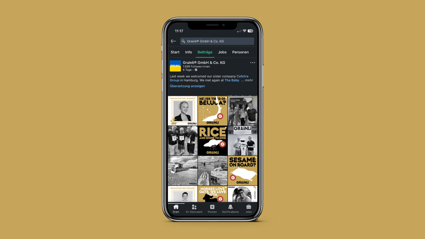
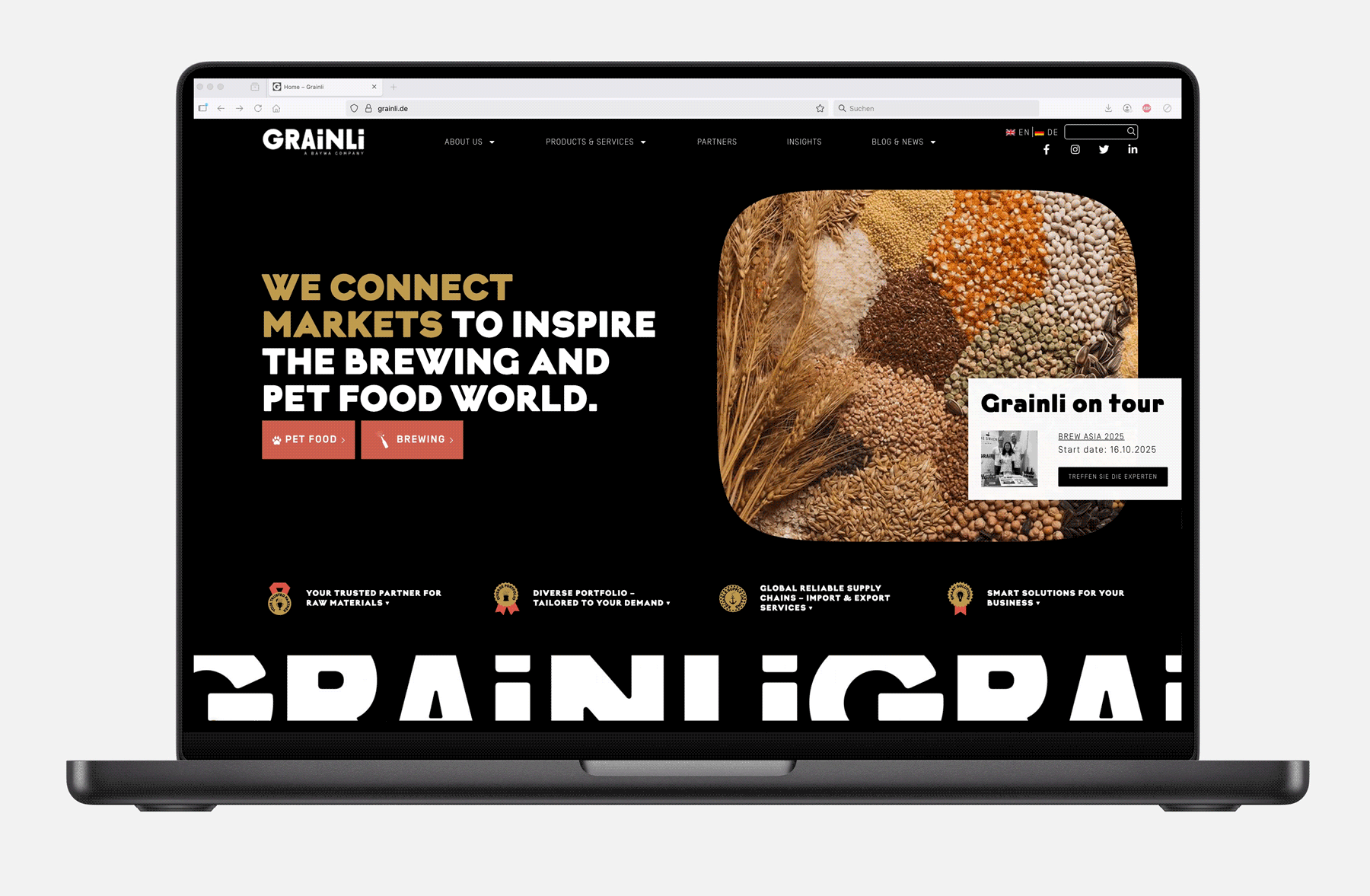
Für unseren Kunden Grainli haben wir eine Marke vom Acker gehoben, die weiß, was sie tut – und wie sie aussieht, wenn sie’s tut. Vom strategischen Fundament bis zum letzten Korn im Logo: alles neu, alles klar, alles Grainli.
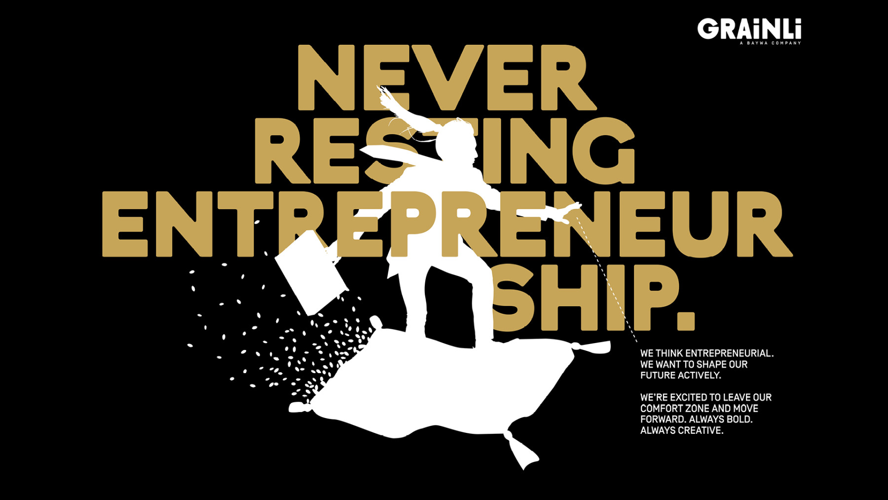
Die Aufgabe: einer internationalen Rohstoffmarke ein Gesicht geben, das nicht nach Traktor riecht, sondern nach Zukunft klingt. Das Ziel: Vertrauen schaffen – mit Haltung, Humor und einem Design, das mehr Struktur hat als jedes Müsli.
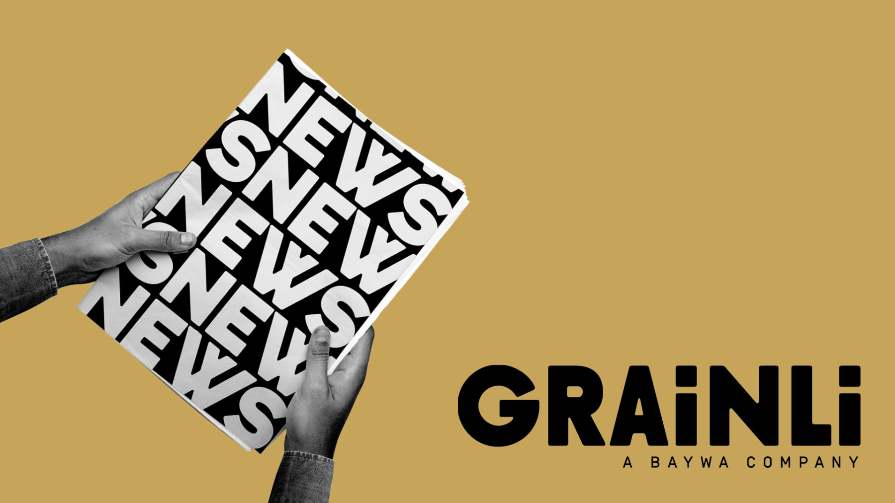
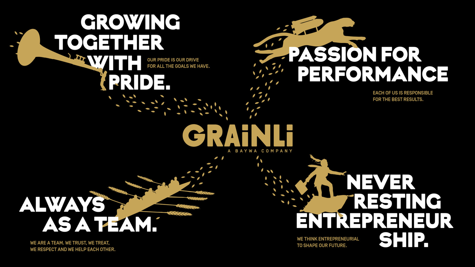
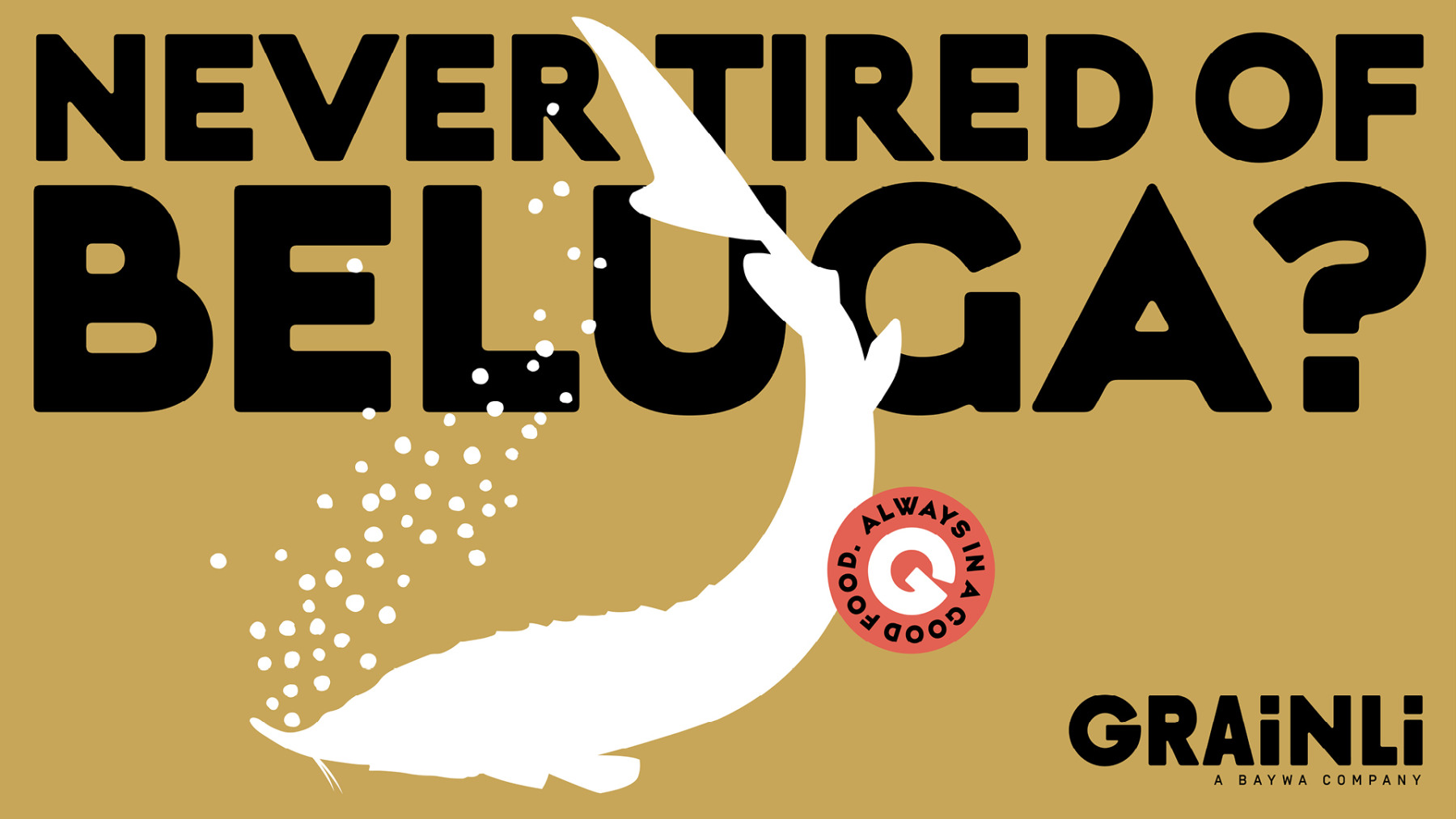
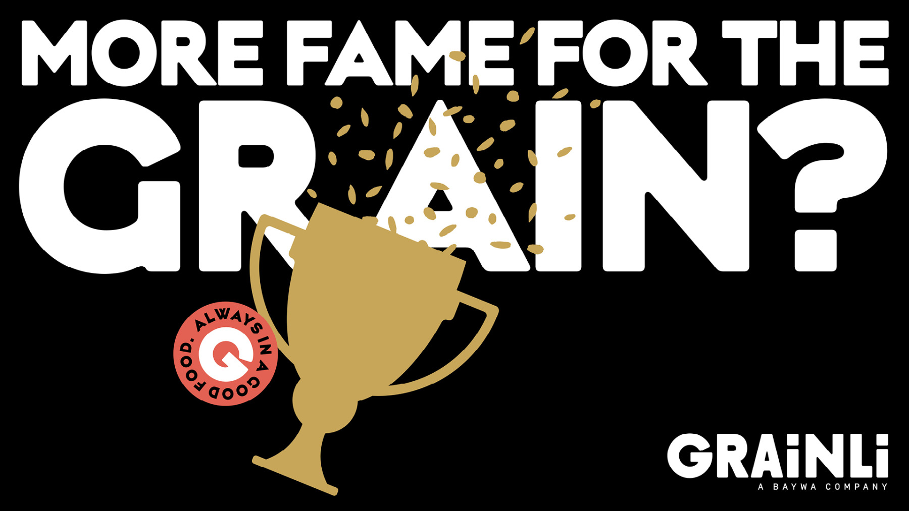
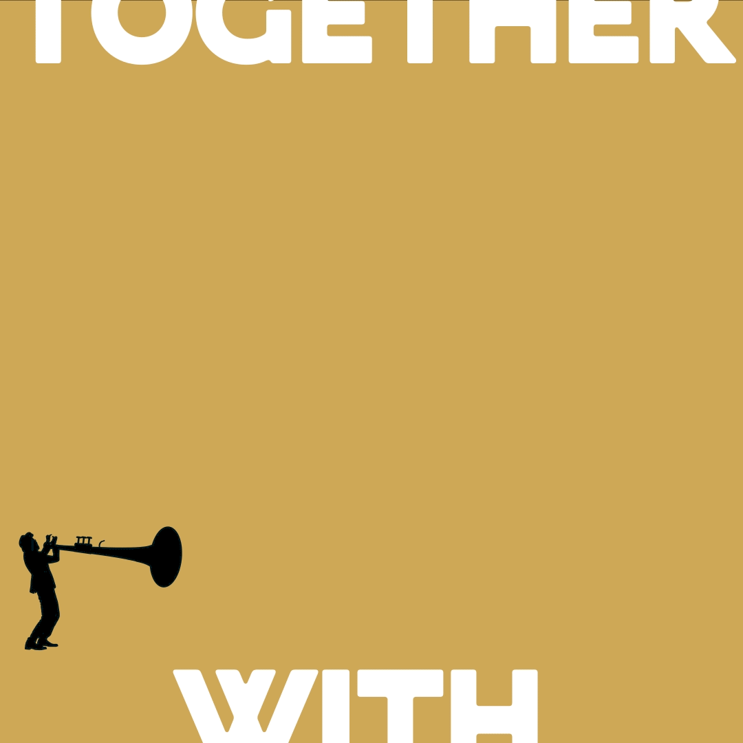
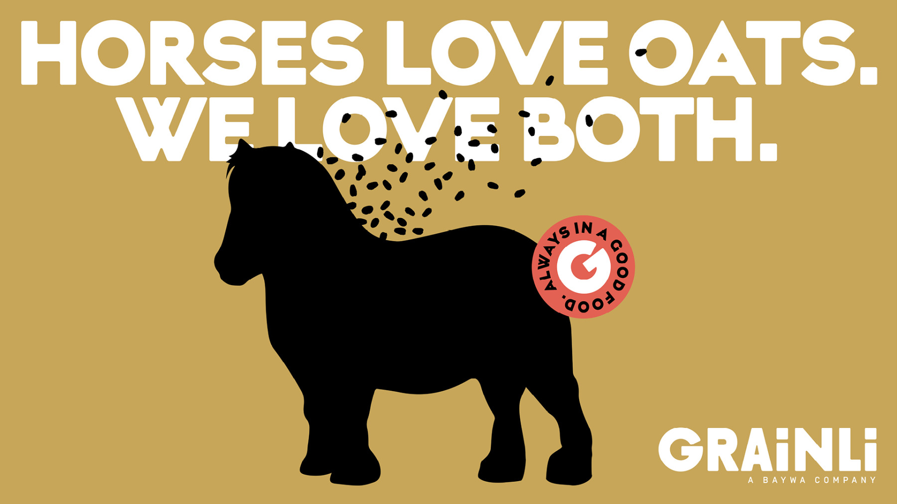
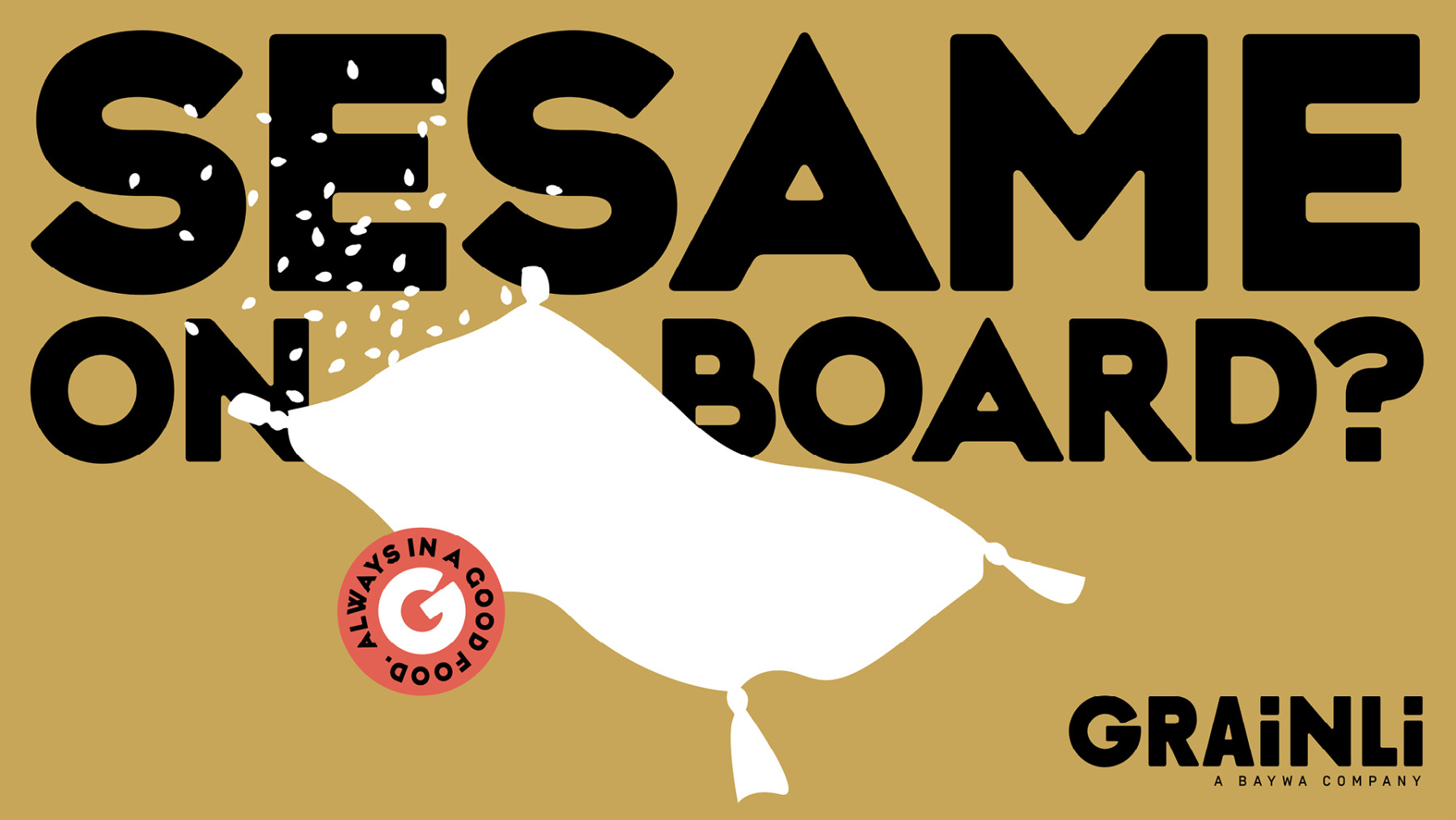
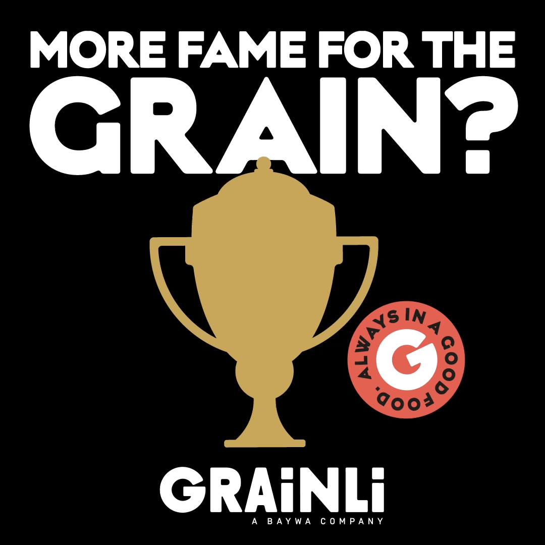
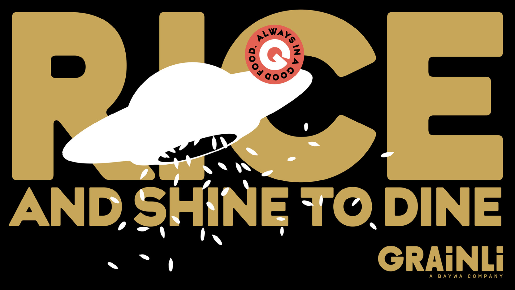
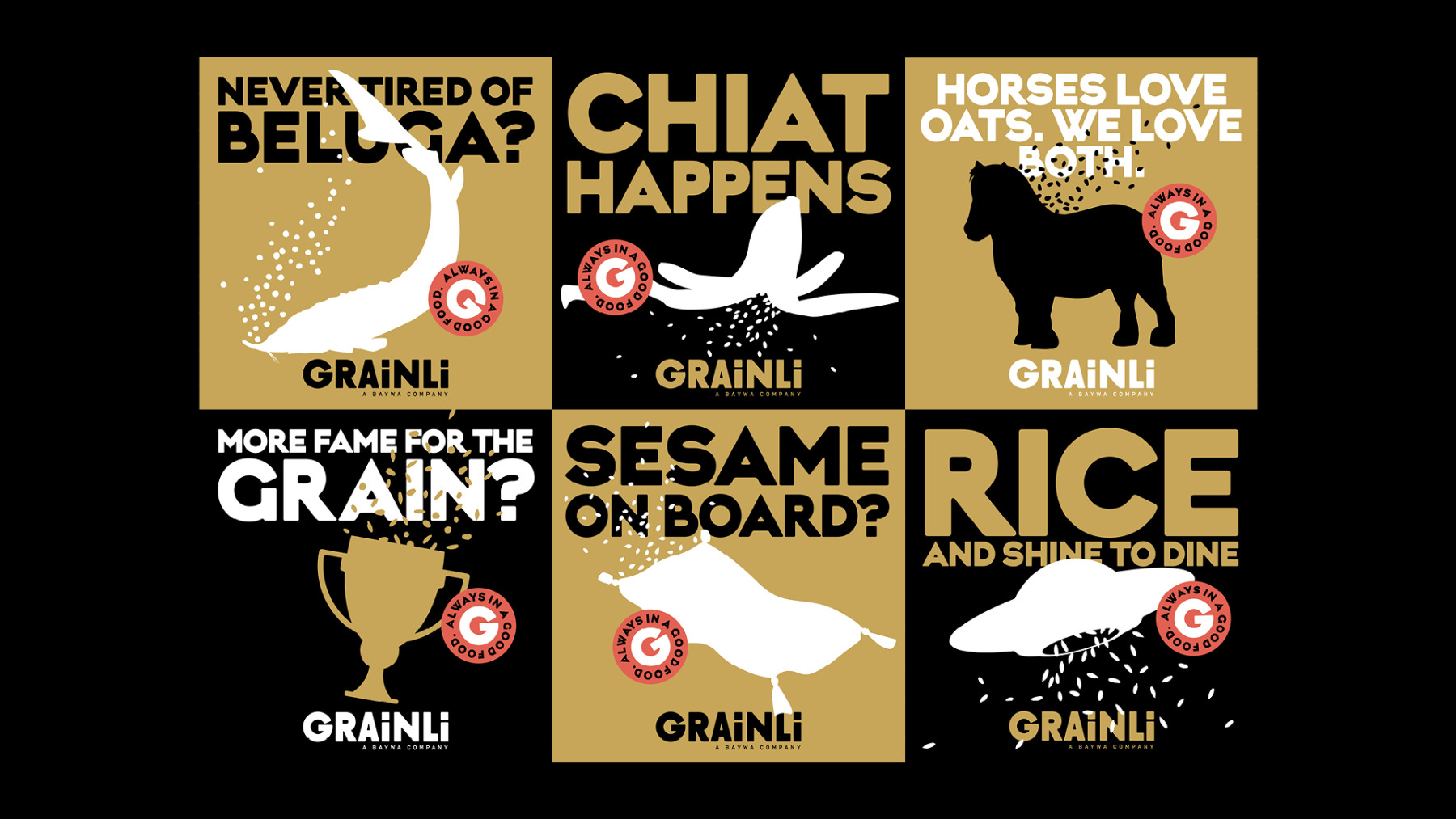
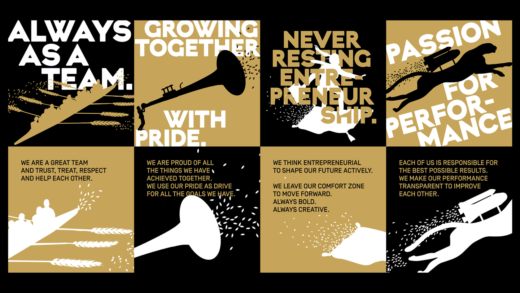
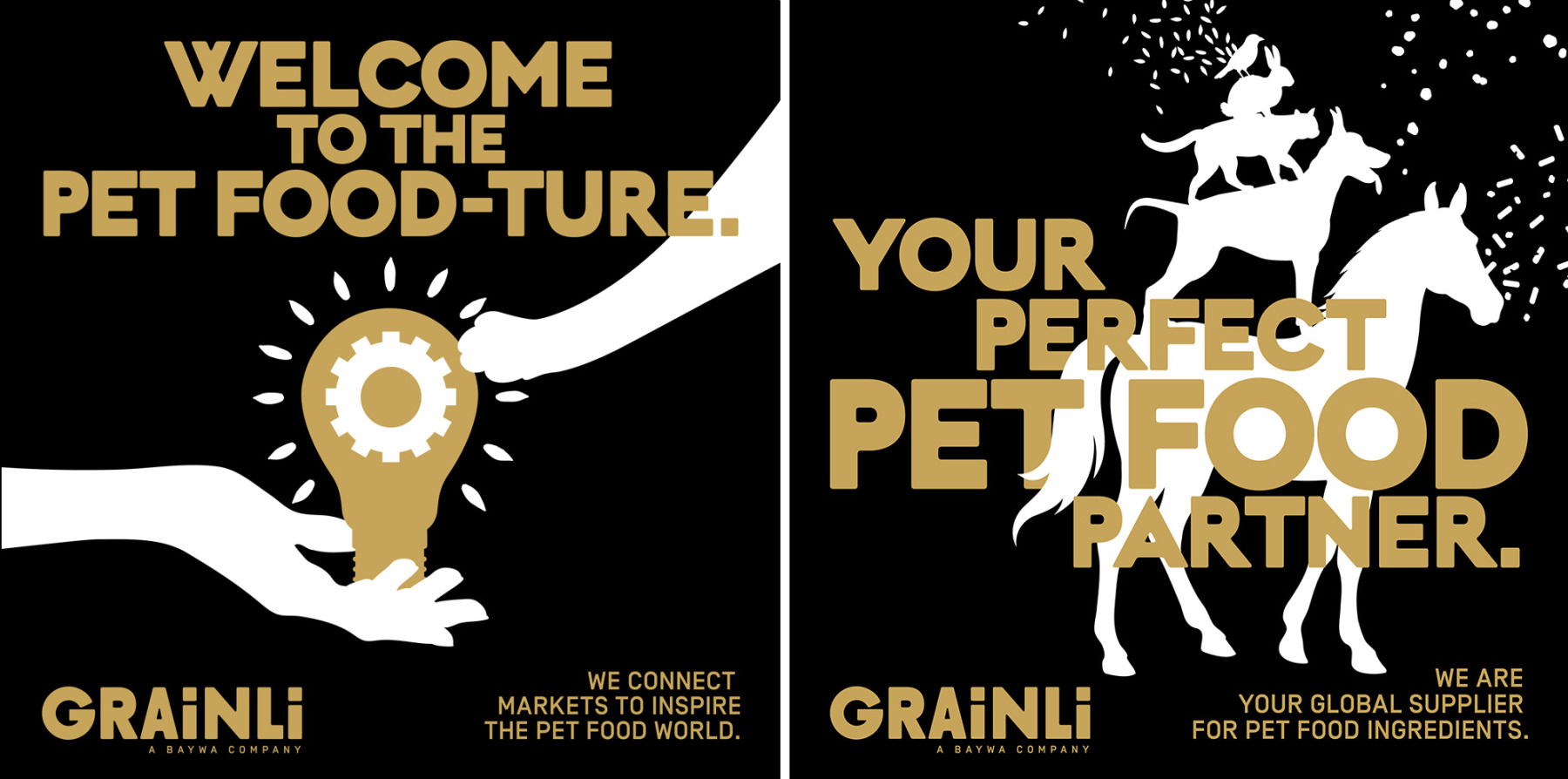
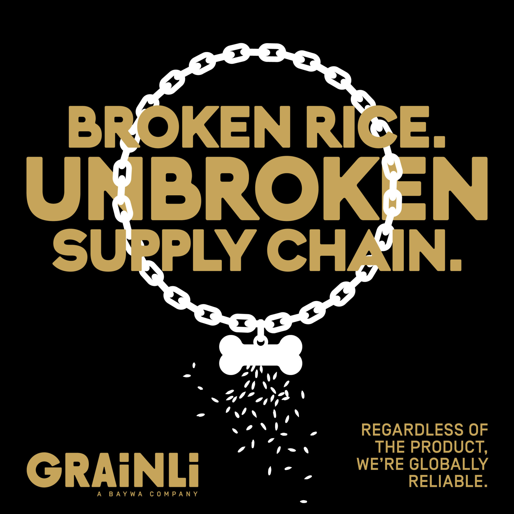
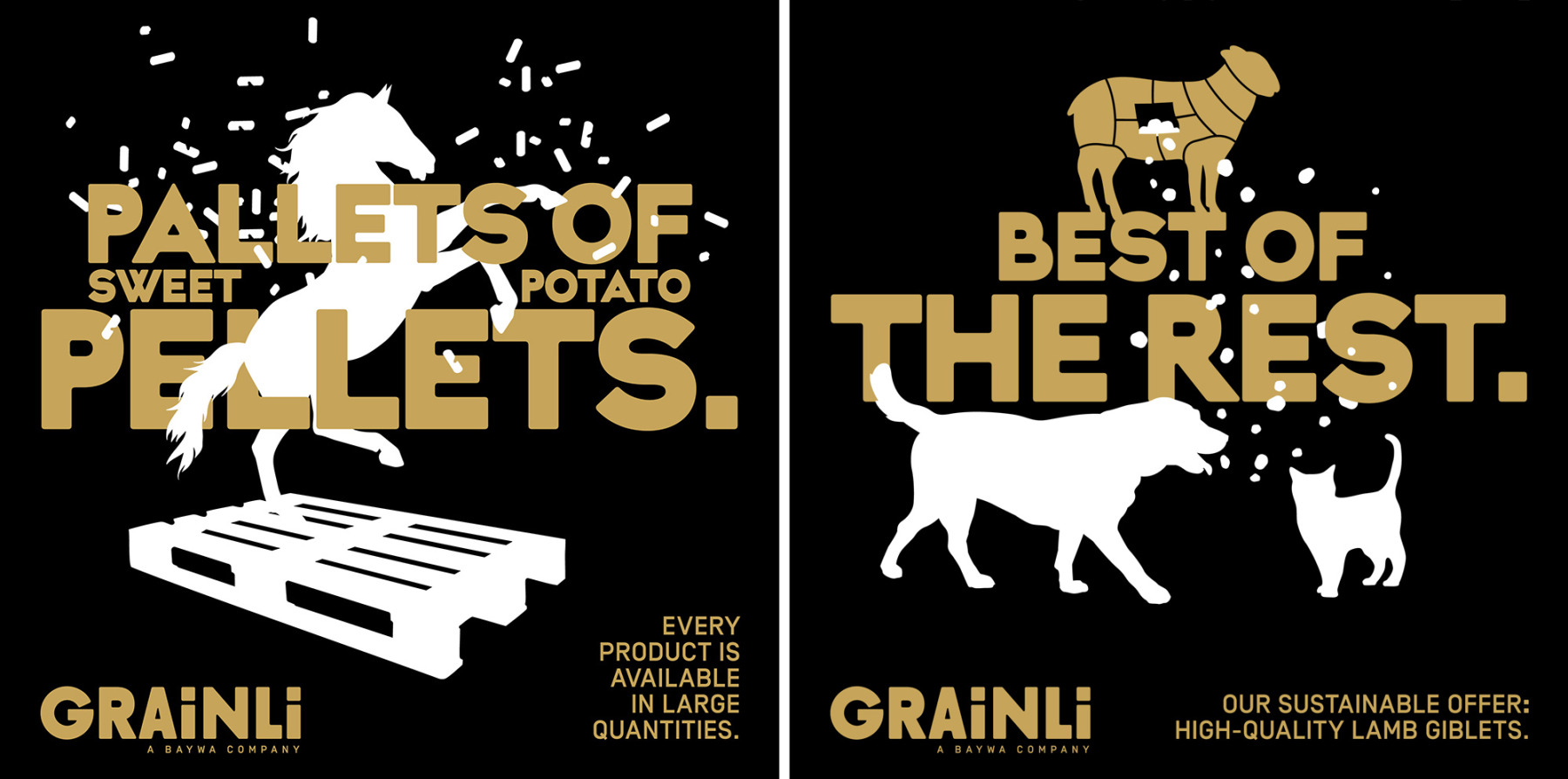
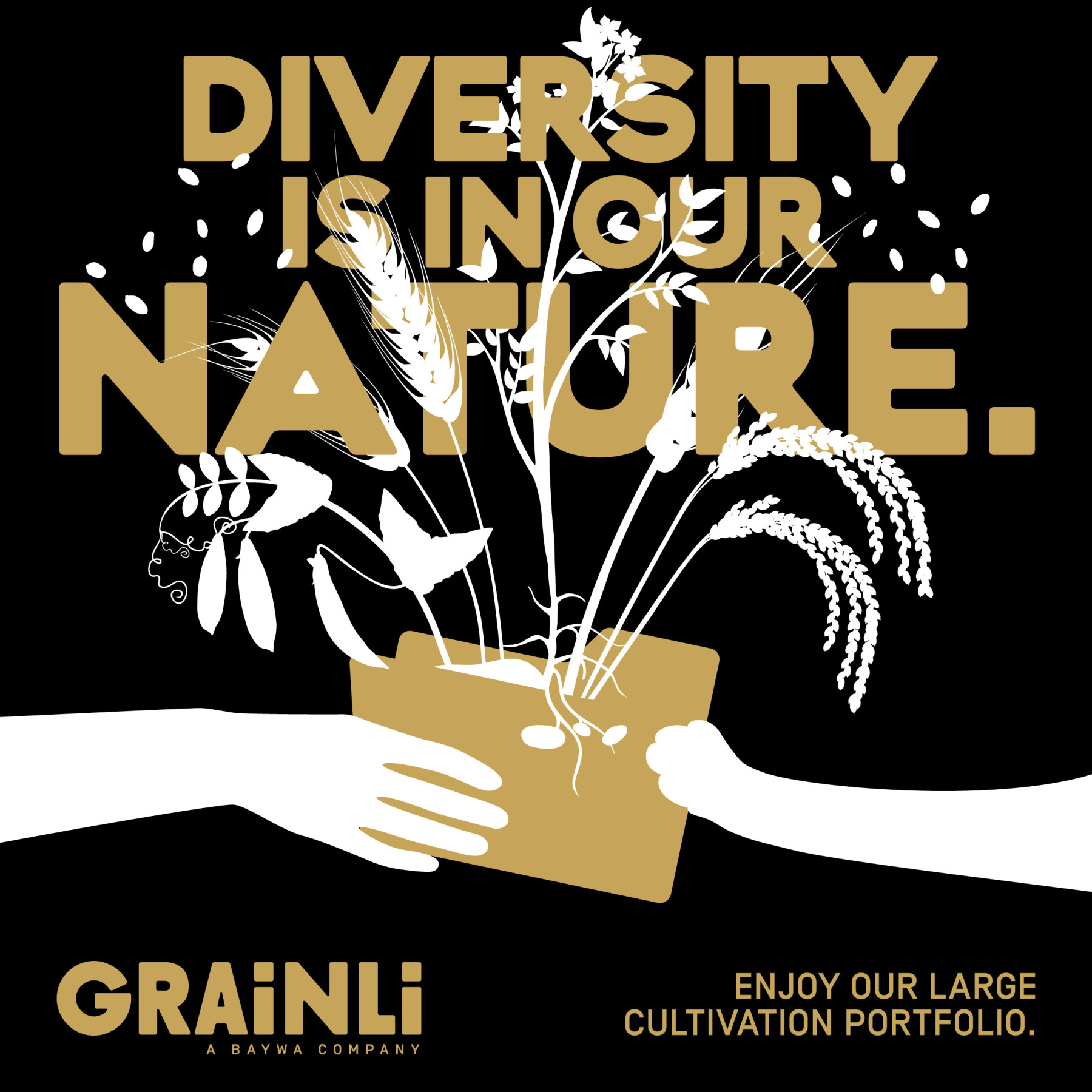
Das neue Branding denkt in Linien statt Ähren, in Typo statt Tristesse. Schwarz, Weiß, Gold – reduziert, aber markant. Headlines und Illustrationen spielen mit dem, was sie verkaufen: Getreide. Nur eben auf Augenhöhe – nicht auf Feldhöhe.
So wurde Grainli zu einer Marke, die zeigt, dass man auch im Rohstoffgeschäft glänzen darf. Nur bitte ohne Hochglanz.
Die Aufgabe: einer internationalen Rohstoffmarke ein Gesicht geben, das nicht nach Traktor riecht, sondern nach Zukunft klingt. Das Ziel: Vertrauen schaffen – mit Haltung, Humor und einem Design, das mehr Struktur hat als jedes Müsli.
Das neue Branding denkt in Linien statt Ähren, in Typo statt Tristesse. Schwarz, Weiß, Gold – reduziert, aber markant. Headlines und Illustrationen spielen mit dem, was sie verkaufen: Getreide. Nur eben auf Augenhöhe – nicht auf Feldhöhe.
So wurde Grainli zu einer Marke, die zeigt, dass man auch im Rohstoffgeschäft glänzen darf. Nur bitte ohne Hochglanz.
For our client Grainli, we grew a brand from the ground up – one that knows exactly what it’s doing, and exactly how it looks while it’s doing it. From the strategic foundation right down to the last grain in the logo: everything new, everything clear, everything Grainli.
The task: give an international commodity brand a face that doesn’t smell of tractors, but sounds like the future.
The goal: build trust – with attitude, wit, and a design that has more structure than your average muesli.
The new branding thinks in lines, not grain stalks. In type, not tiredness. Black, white, gold – minimal, yet unmistakable. Headlines and illustrations play with what Grainli trades in: grain. Just at eye level – not down at field level.
That’s how Grainli became a brand that proves you’re allowed to shine, even in the commodities business. Just without the high gloss.


Grainli. Markenentwicklung.
MORE STUFF
Loading...