Flaym. Markenentwicklung.
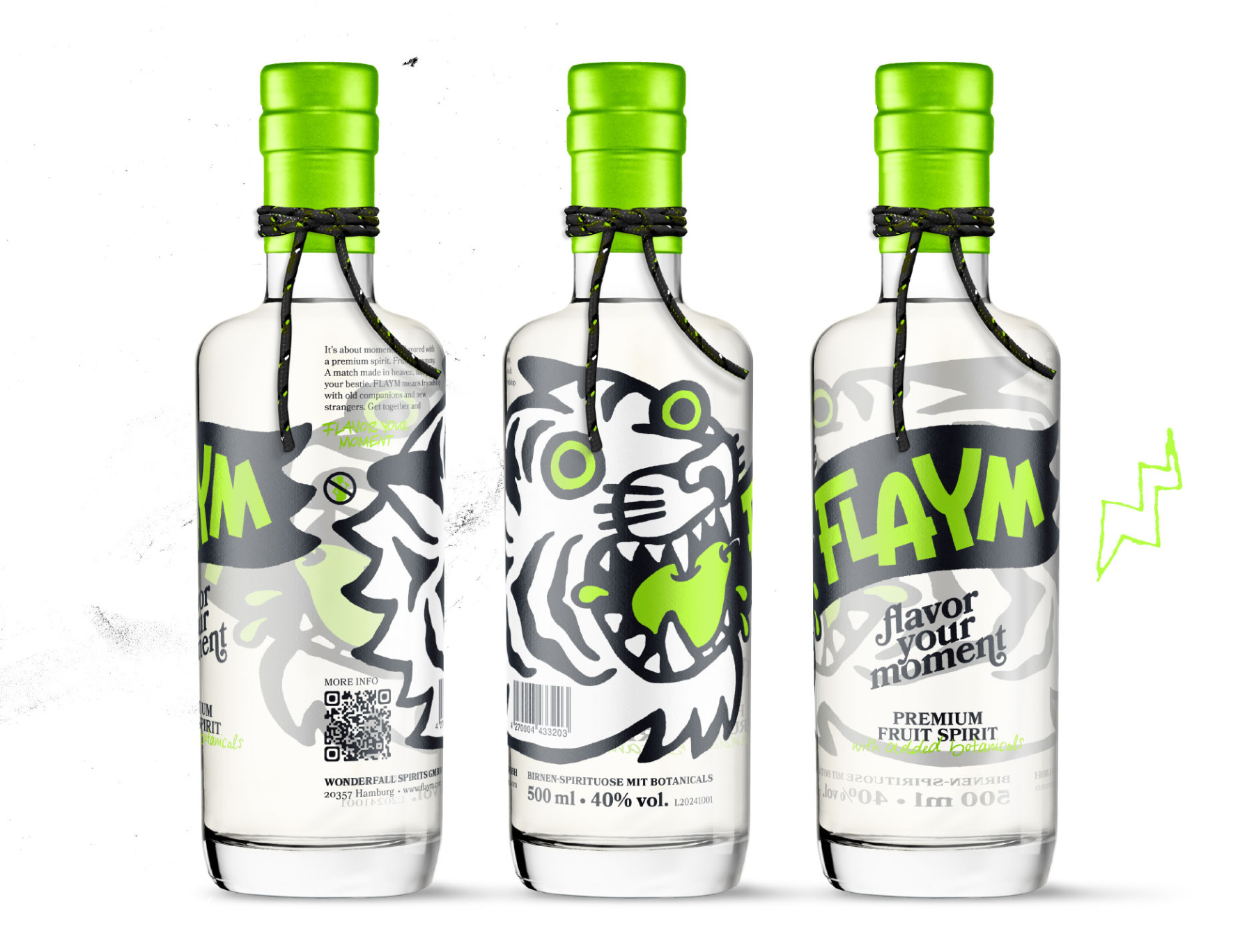
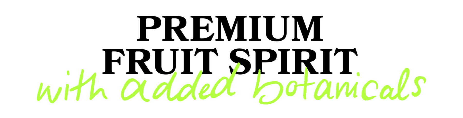
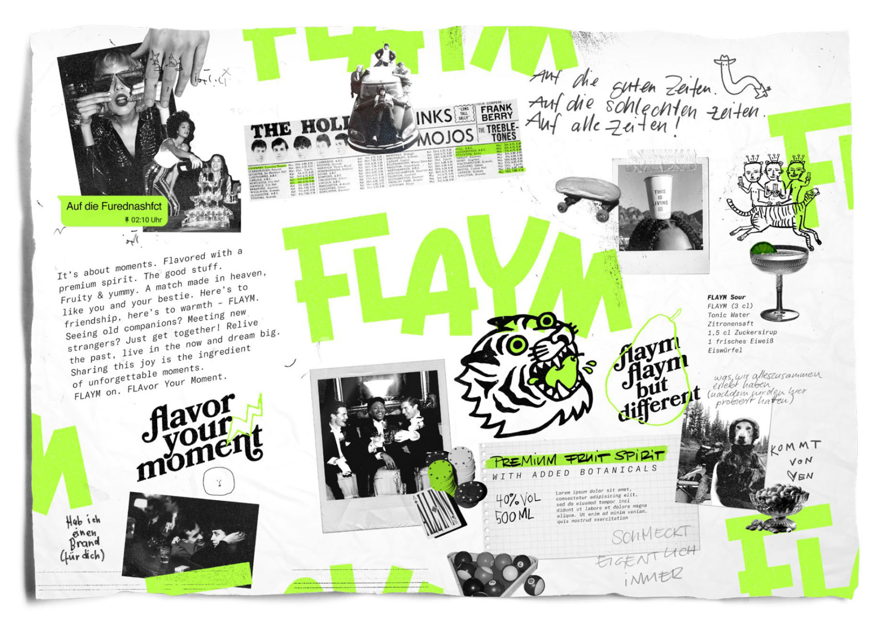
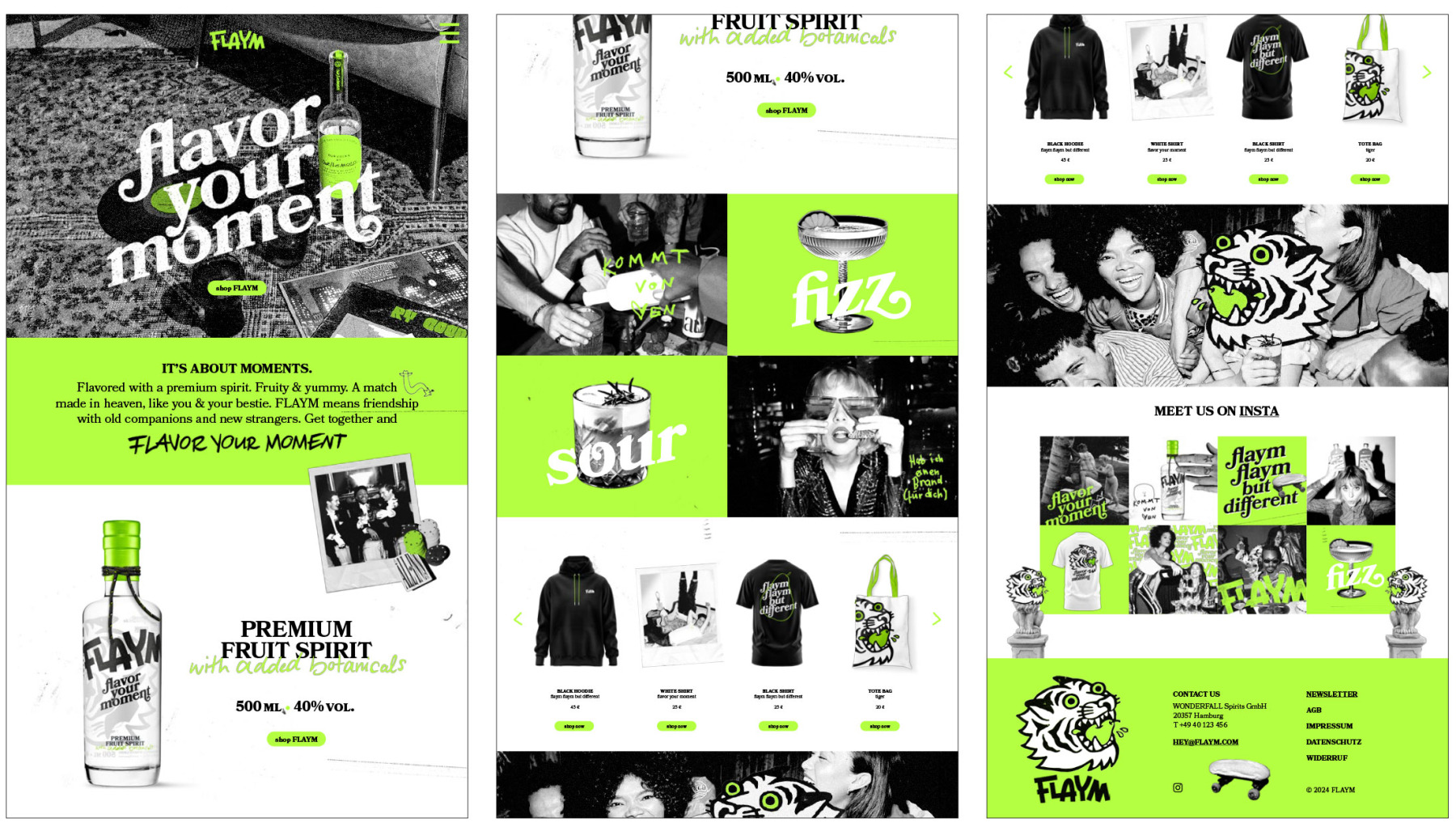
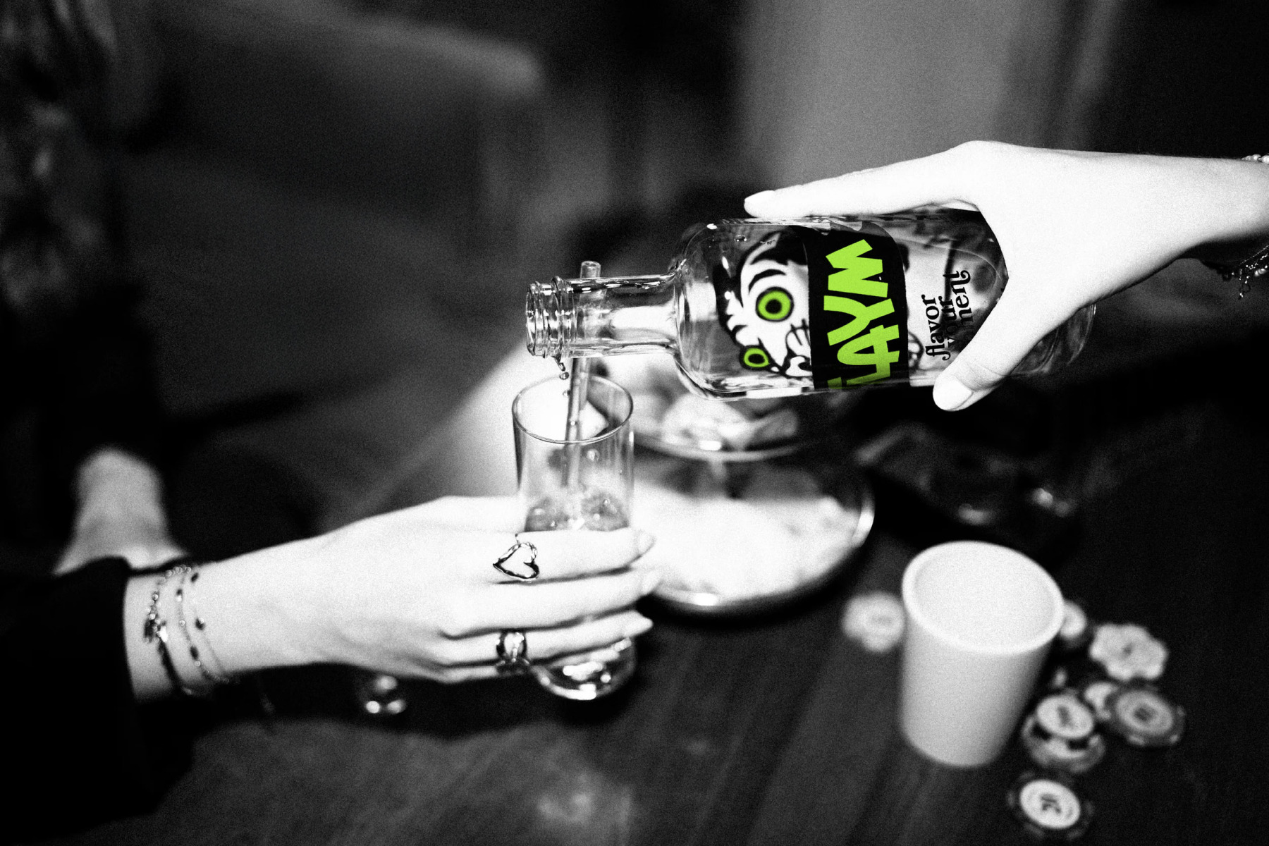
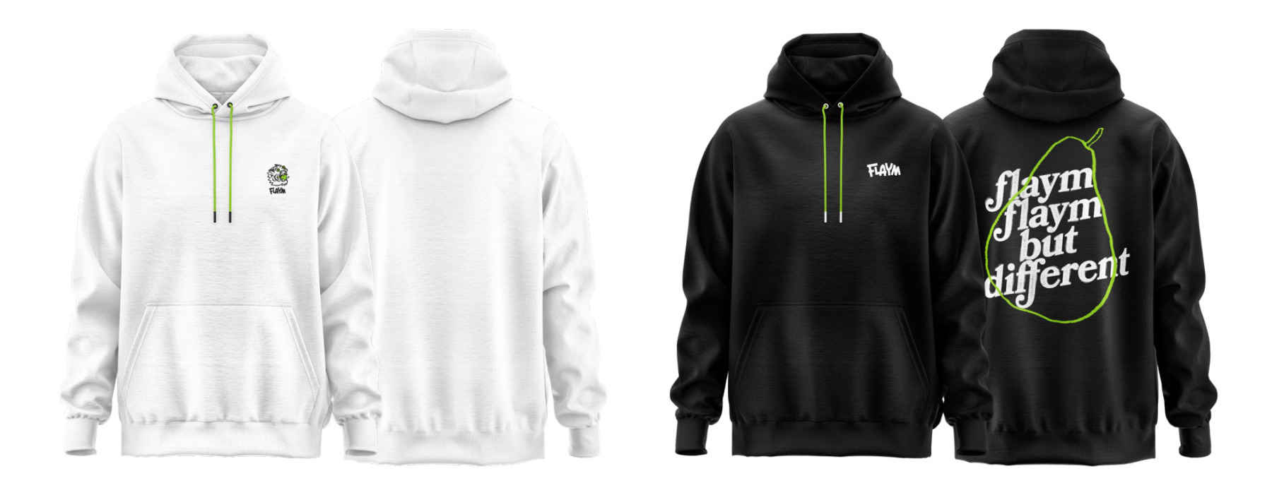
FLAYM ist eine Obstbrandmarke auf Birnenbasis, irgendwo zwischen Bar, Küche und guter Laune. Unsere Aufgabe: Markenentwicklung und Packaging Design – ein Branding, das schon auf der Flasche klar macht, dass hier nicht der klassische Opa-Schnaps wartet, sondern ein moderner Obstbrand mit „Flavor Your Moment“-Energie.
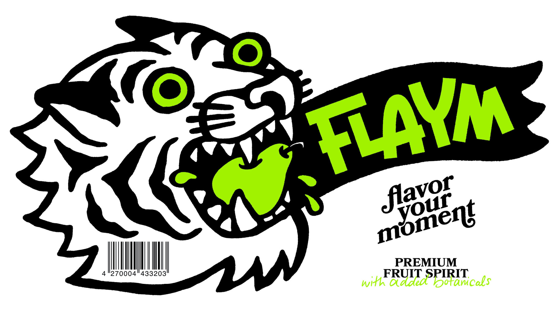
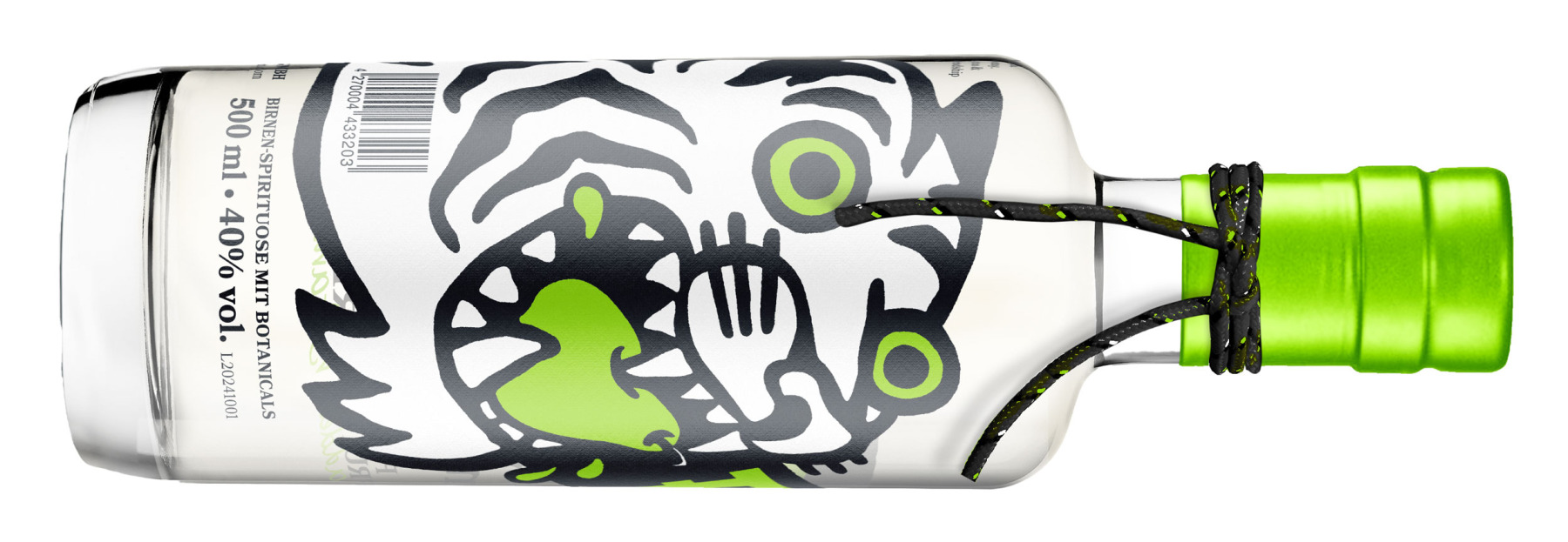
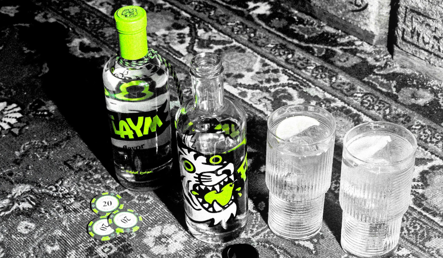
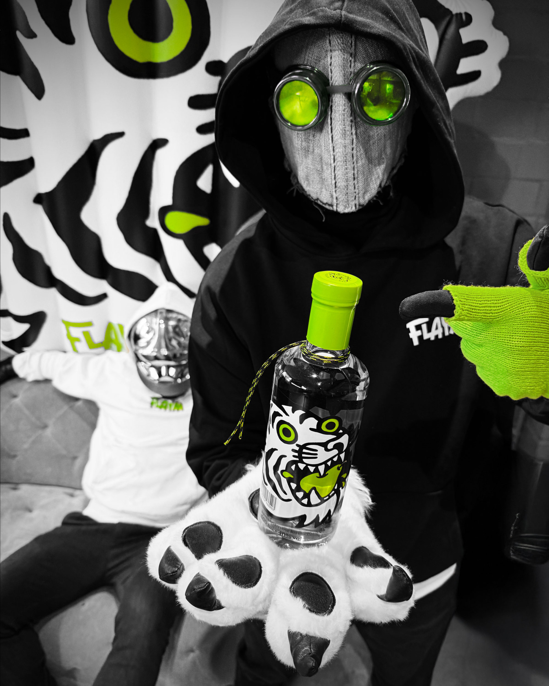
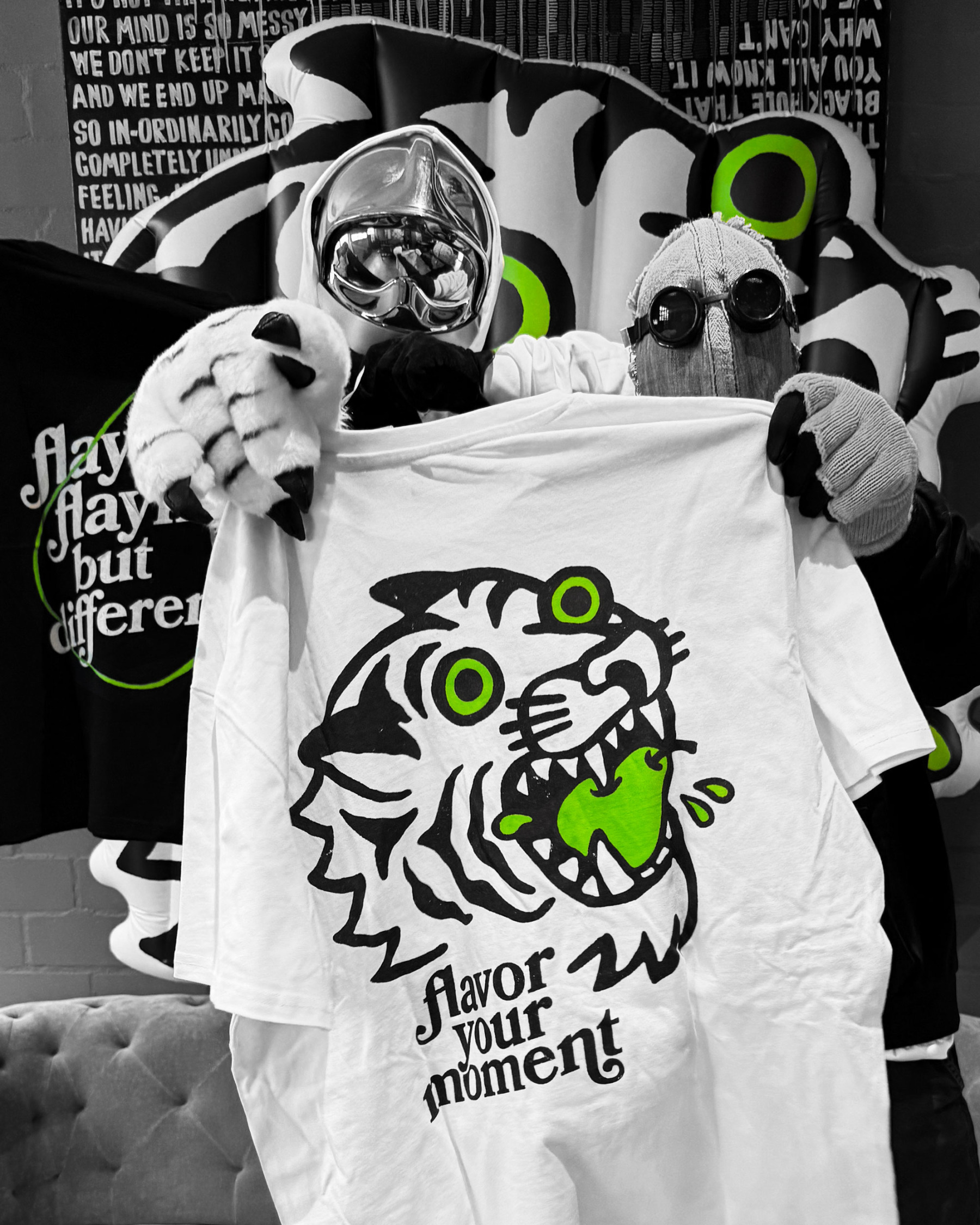
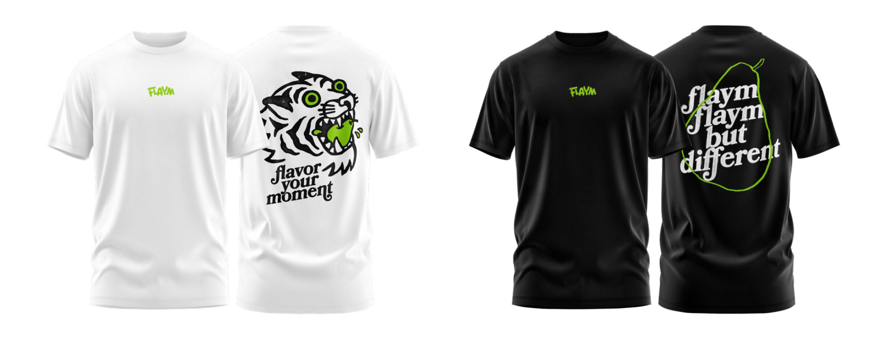
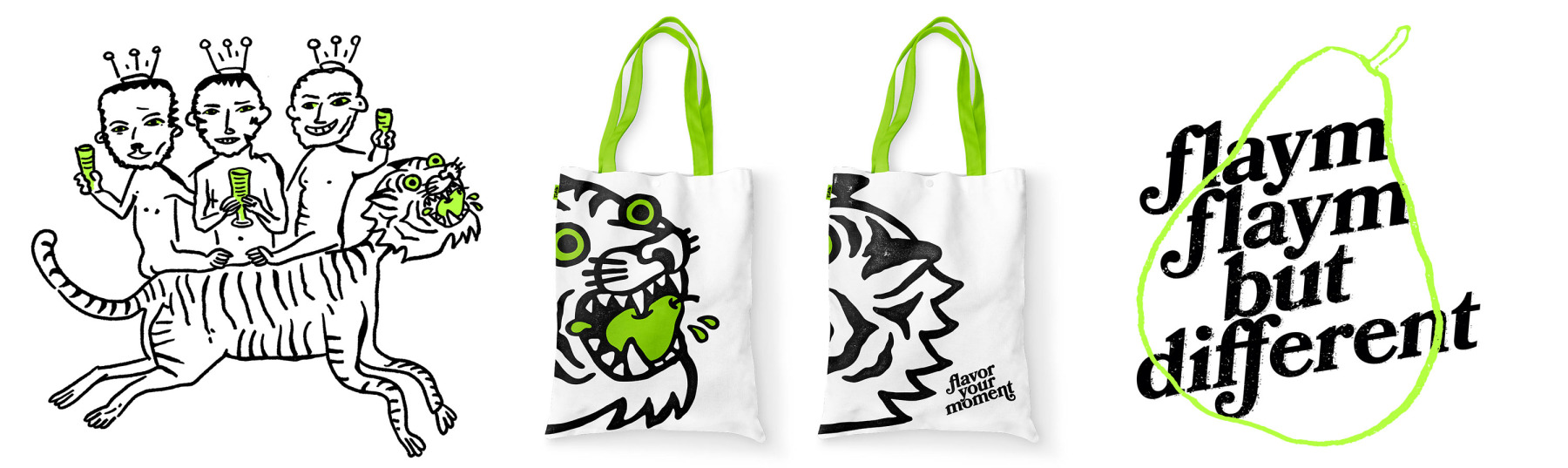
Im Zentrum steht die Birne als Key Ingredient: sattes Grün als einzige Markenfarbe und ein Tiger, der sich sichtbar ins Obst verbeißt. Die Kombination aus ikonischer Illustration und handgezeichneter Typo bricht bewusst mit den üblichen Spirituosen-Codes und macht FLAYM zum Blickfang im Regal – ein Packaging Design, das eher Charakterflasche als Kaminzimmer-Requisite spielt.
Im Zentrum steht die Birne als Key Ingredient: sattes Grün als einzige Markenfarbe und ein Tiger, der sich sichtbar ins Obst verbeißt. Die Kombination aus ikonischer Illustration und handgezeichneter Typo bricht bewusst mit den üblichen Spirituosen-Codes und macht FLAYM zum Blickfang im Regal – ein Packaging Design, das eher Charakterflasche als Kaminzimmer-Requisite spielt.
FLAYM is a pear-based fruit brandy brand, somewhere between bar, kitchen and good times. Our task: brand development and packaging design – a visual identity that makes it clear right on the bottle that this isn’t your grandfather’s schnapps, but a modern fruit brandy with full “Flavor Your Moment” energy.
At the centre is the pear as key ingredient: rich green as the only brand colour and a tiger visibly sinking its teeth into the fruit. The combination of iconic illustration and hand-drawn type deliberately breaks with classic spirits codes and turns FLAYM into a real eye-catcher on shelf – packaging design that feels more like a character bottle than fireplace decoration.
At the centre is the pear as key ingredient: rich green as the only brand colour and a tiger visibly sinking its teeth into the fruit. The combination of iconic illustration and hand-drawn type deliberately breaks with classic spirits codes and turns FLAYM into a real eye-catcher on shelf – packaging design that feels more like a character bottle than fireplace decoration.


Flaym. Markenentwicklung.
MORE STUFF
Loading...