fritz-kola. superzero.
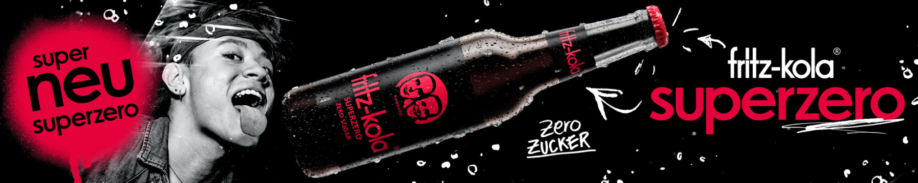
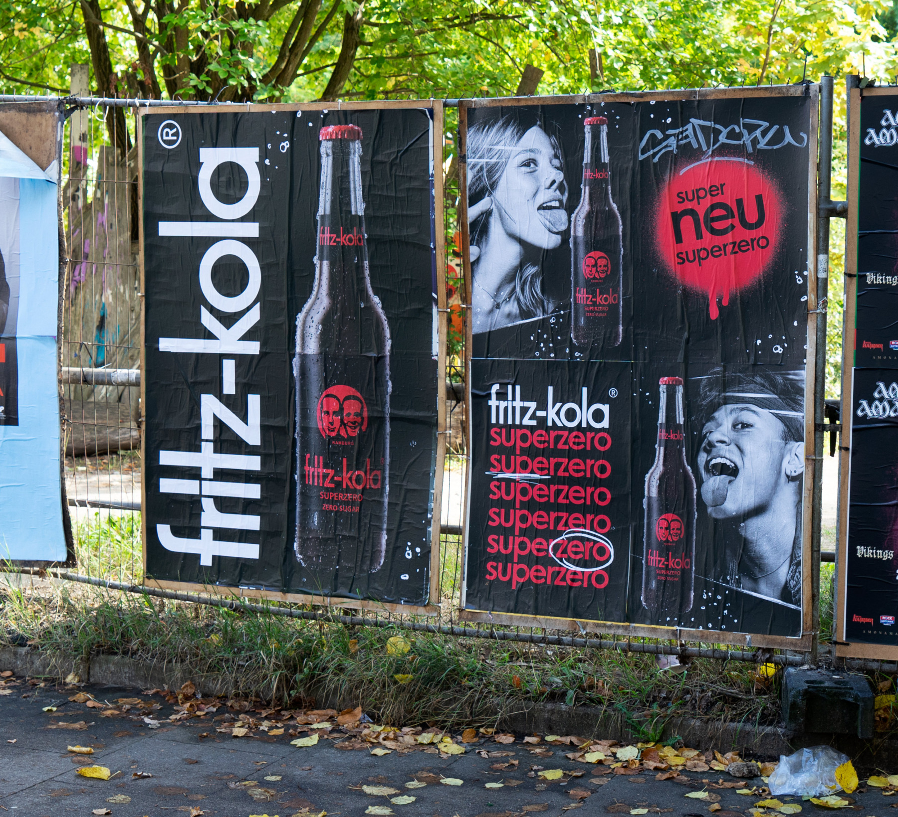
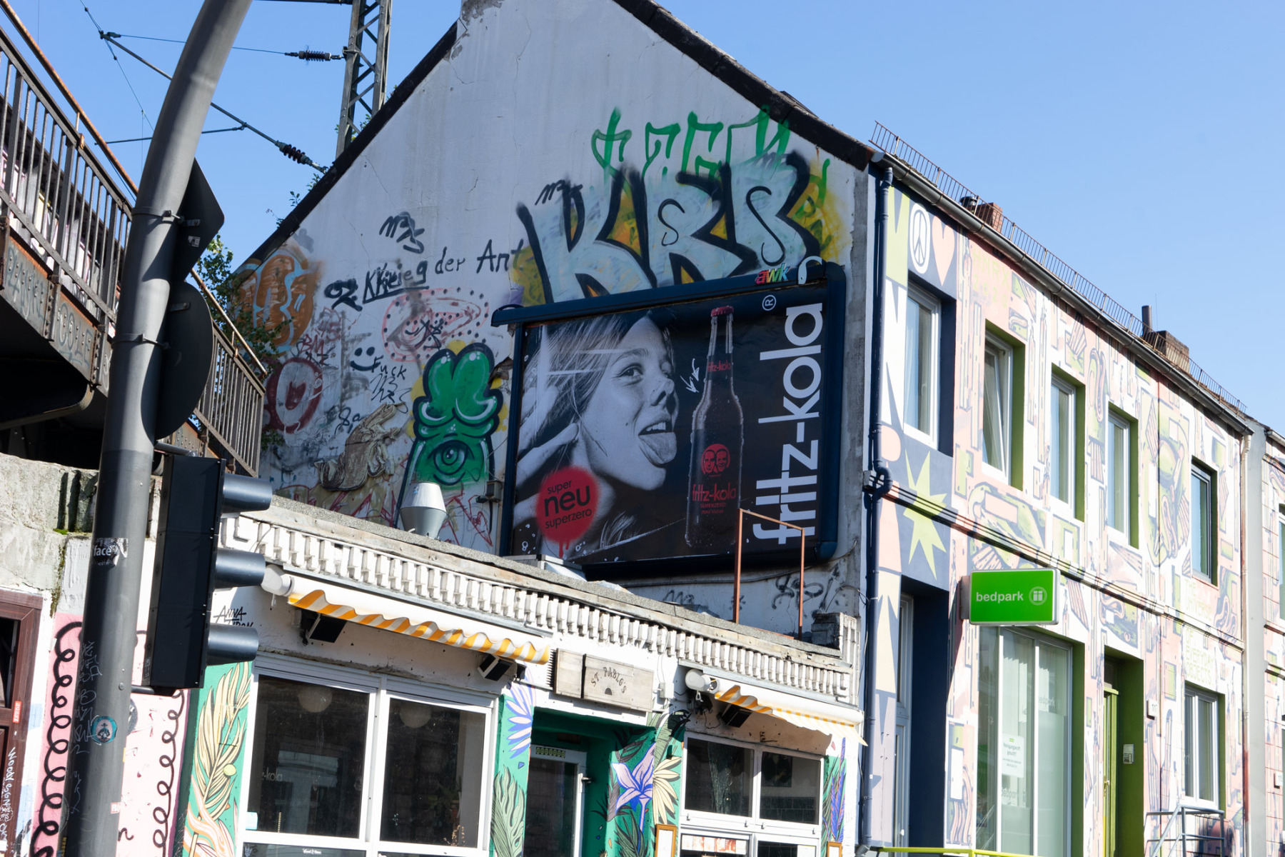
Wir haben für fritz-kola die super zero von der ersten Idee bis zur ersten klebrigen Plakatkante mitentwickelt: Branding, Markenentwicklung, Packaging (Etikett) und Kampagnenflight – einmal alles, bitte, nur ohne Zucker.
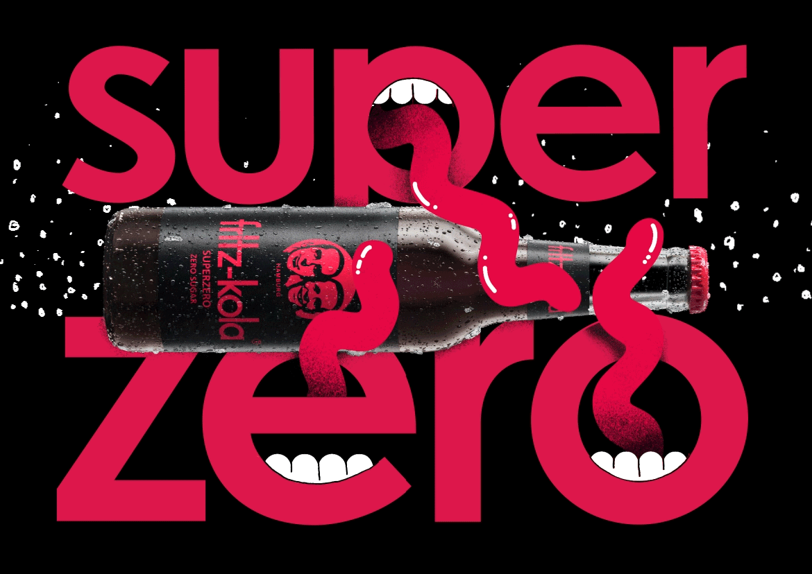
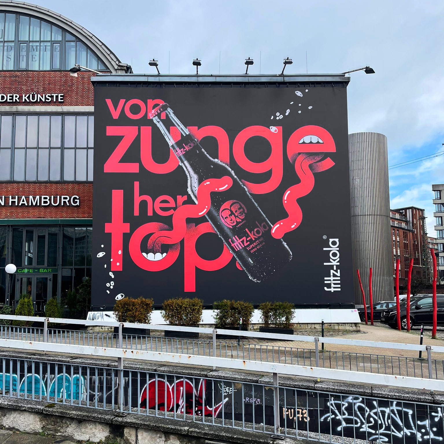
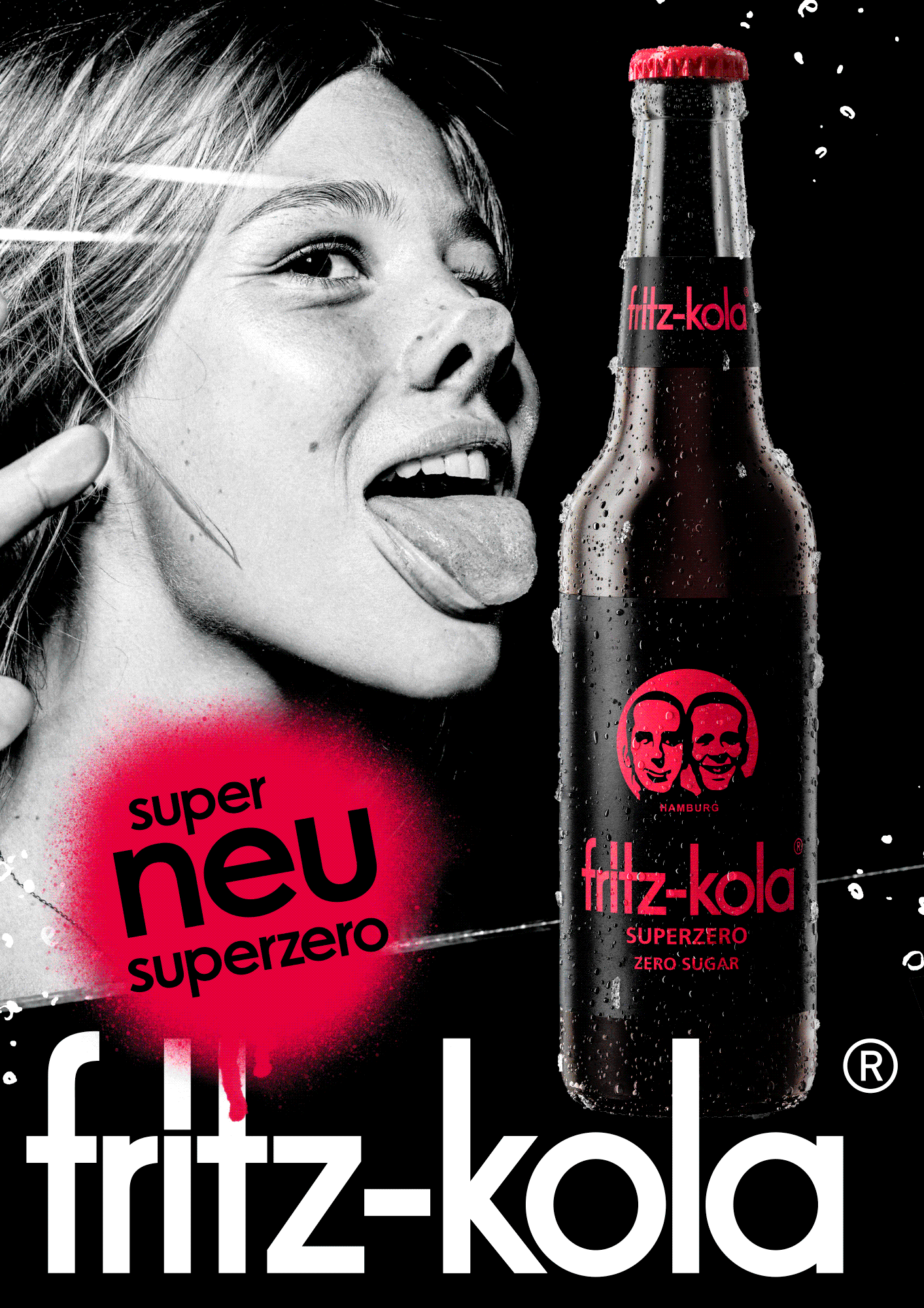
Denn „Zero“ ist im Marketing oft das Wort für „Jetzt wird’s traurig“. Wie ein Luftballon ohne Luft, nur mit mehr Anspruch. Also haben wir die Richtung gedreht: super statt „nur noch“. Ein Auftritt wie ein kurzes Schlagzeugsolo auf der Zunge: Schwarz/Rot, Typo auf Anschlag, Motive, die sich festsetzen wie Kaugummi unter Sneakern – unvernünftig, aber wirkungsvoll.
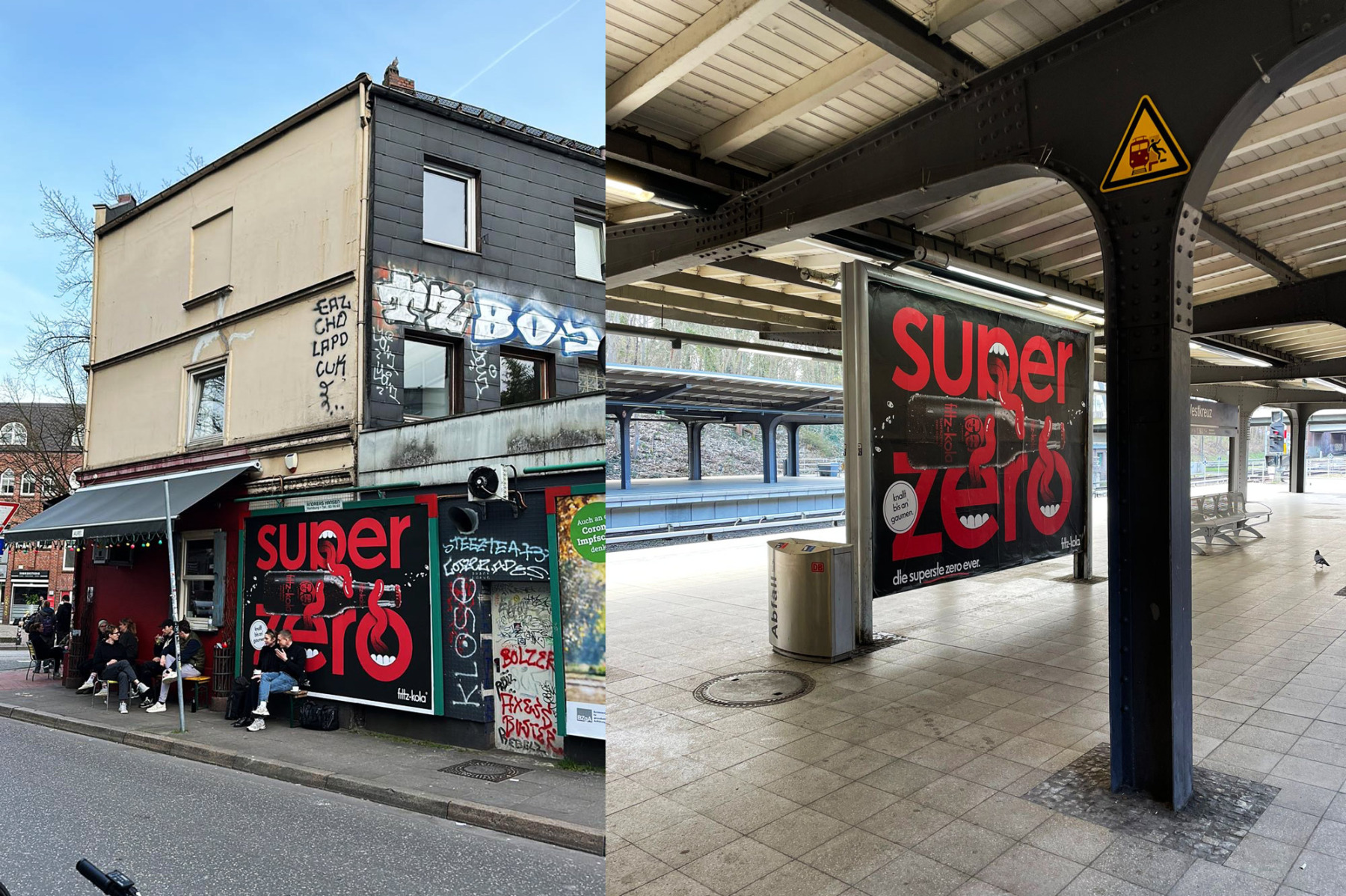
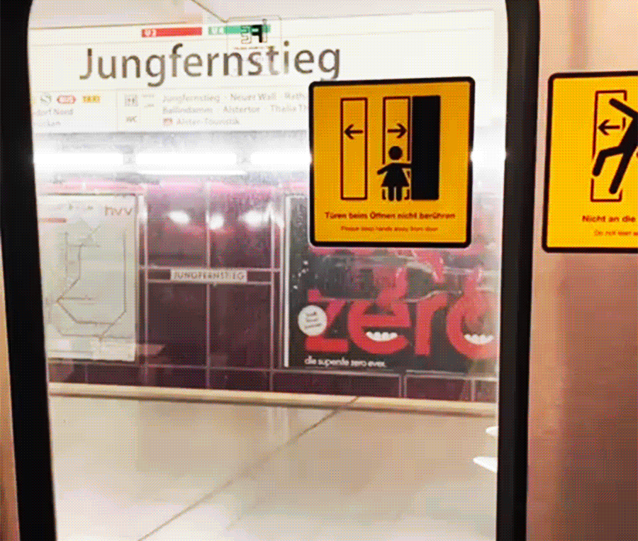
Wirkung: Markteinführung geglückt. OOH, City, Station – überall dieselbe klare Ansage: Zero Zucker, null Langeweile. Mehr Brand Awareness, mehr Visibility, mehr „Hab ich gesehen“-Reflex.
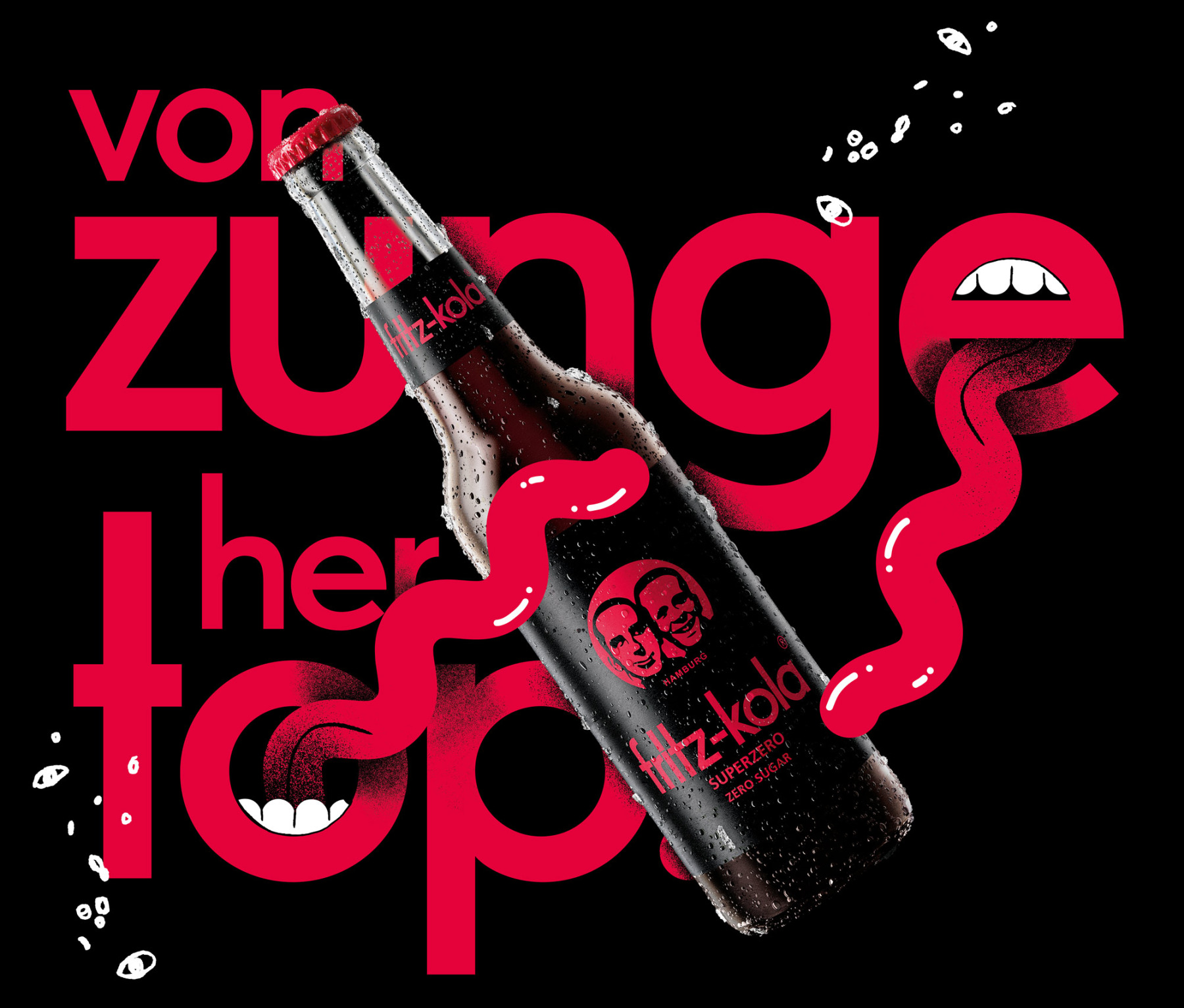
Kurz: Von Zunge her top. Und von Marke her auch.
Denn „Zero“ ist im Marketing oft das Wort für „Jetzt wird’s traurig“. Wie ein Luftballon ohne Luft, nur mit mehr Anspruch. Also haben wir die Richtung gedreht: super statt „nur noch“. Ein Auftritt wie ein kurzes Schlagzeugsolo auf der Zunge: Schwarz/Rot, Typo auf Anschlag, Motive, die sich festsetzen wie Kaugummi unter Sneakern – unvernünftig, aber wirkungsvoll.
Wirkung: Markteinführung geglückt. OOH, City, Station – überall dieselbe klare Ansage: Zero Zucker, null Langeweile. Mehr Brand Awareness, mehr Visibility, mehr „Hab ich gesehen“-Reflex.
Kurz: Von Zunge her top. Und von Marke her auch.
Rocket & Wink helped develop super zero for fritz-kola from the first idea to the first sticky poster edge: branding, brand development, packaging (label design) and campaign rollout — the full package, please, just without the sugar.
Because in marketing, “zero” often means: things are about to get sad. Like a balloon without air, only with more ambition. So we flipped the direction: super instead of “less”. A visual identity like a short drum solo on the tongue: black and red, typography turned all the way up, imagery that sticks like gum to your sneakers — irrational, but effective.
The result: successful market launch. OOH, city, station — everywhere the same clear message: zero sugar, zero boredom. More brand awareness, more visibility, more of that “seen it already” reflex.
In short: top on the tongue. And on brand, too.

fritz-kola. superzero.
MORE STUFF
Loading...