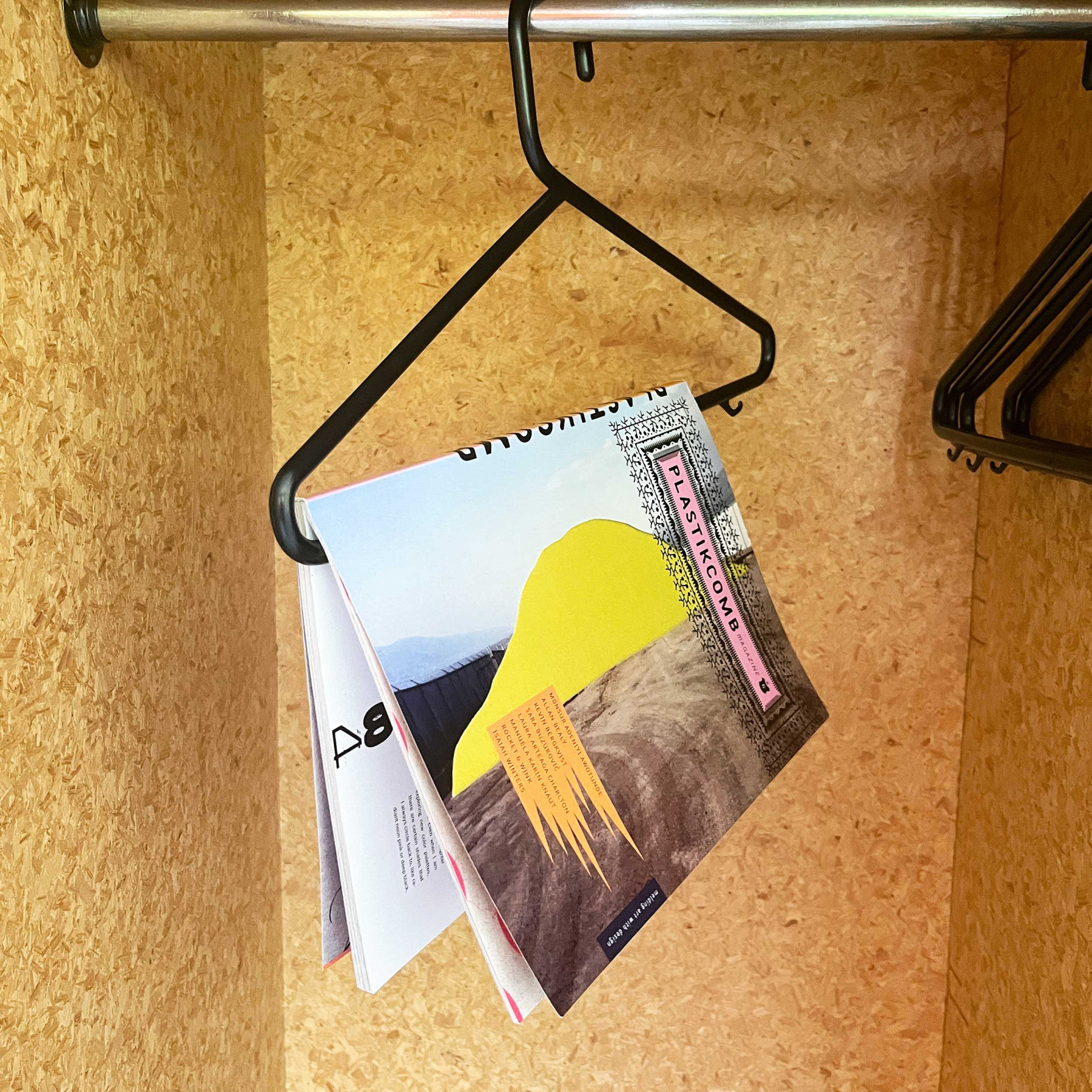
Plastikcomb N°6. Interview Editorial.
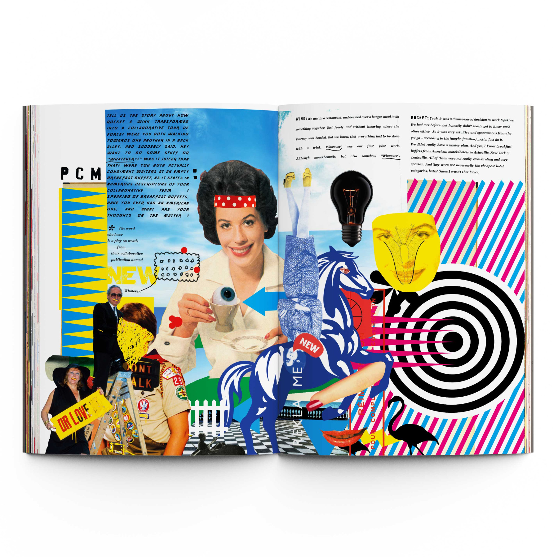
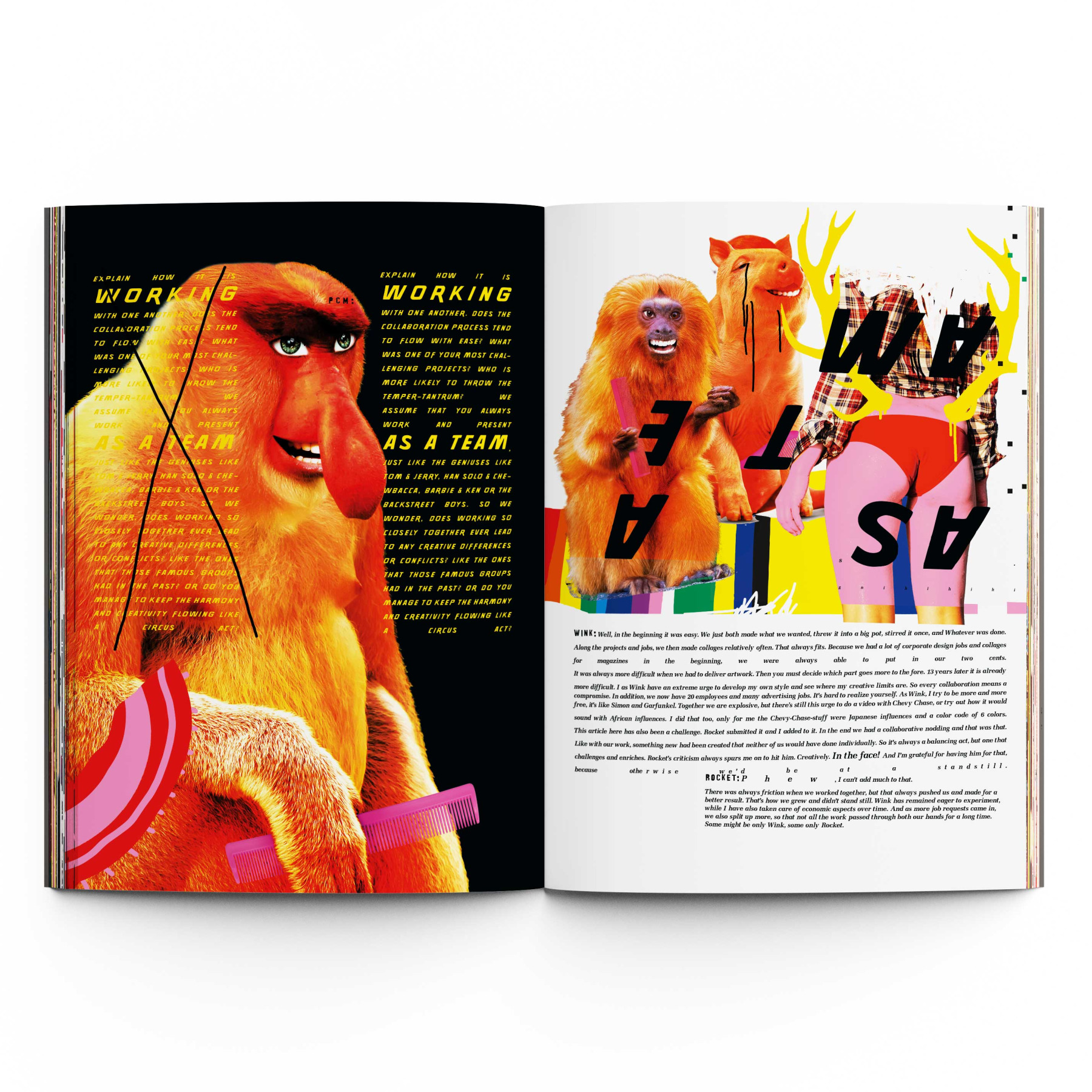
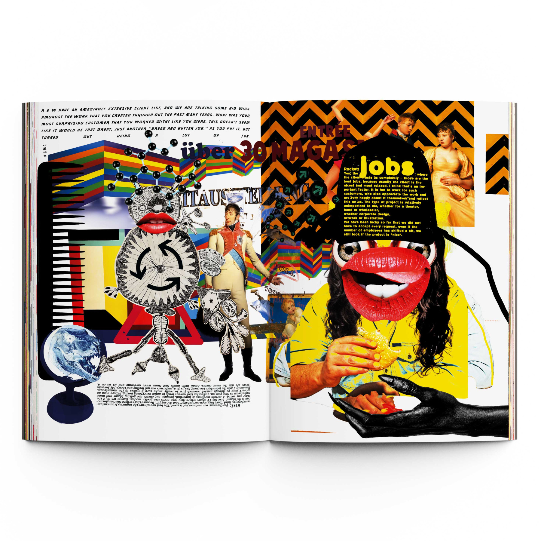
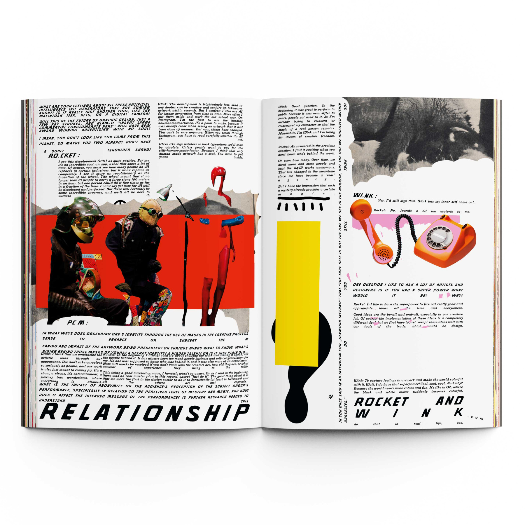
Für Plastikcomb N°6 durften wir unsere eigene Interviewstrecke visuell gestalten – als Editorial, das von der Mischung aus Typo und Bild lebt. Plastikcomb trägt diese freie 90er-Jahre-Typografie weiter, irgendwo zwischen Raygun und David Carson: roh, mutig, gerne ein bisschen daneben (im besten Sinn).
Unsere Aufgabe war deshalb nicht „schön machen“, sondern Typografie als Bild denken: Worte als Flächen, Rhythmus statt Regeln, Layout als Gefühl. Für uns war das ein kleiner Traum – weil wir Fans der ersten Stunde sind und hier einfach mal nicht für die Marke gearbeitet haben, sondern fürs Herz.
Unsere Aufgabe war deshalb nicht „schön machen“, sondern Typografie als Bild denken: Worte als Flächen, Rhythmus statt Regeln, Layout als Gefühl. Für uns war das ein kleiner Traum – weil wir Fans der ersten Stunde sind und hier einfach mal nicht für die Marke gearbeitet haben, sondern fürs Herz.
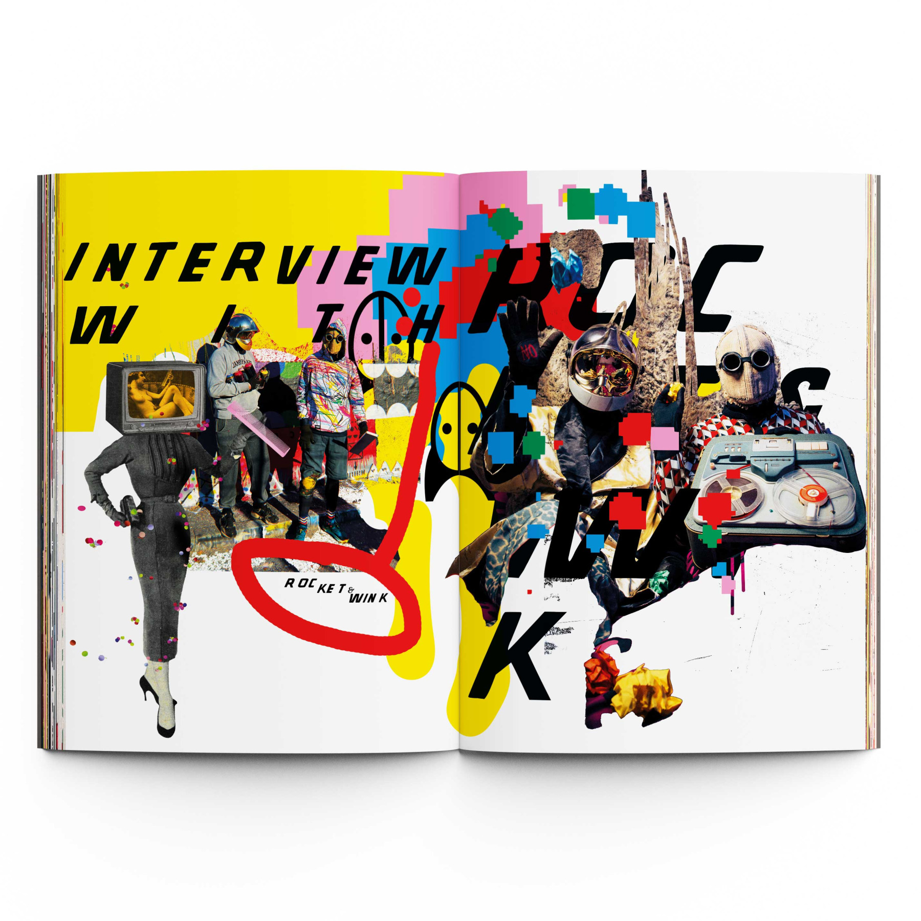
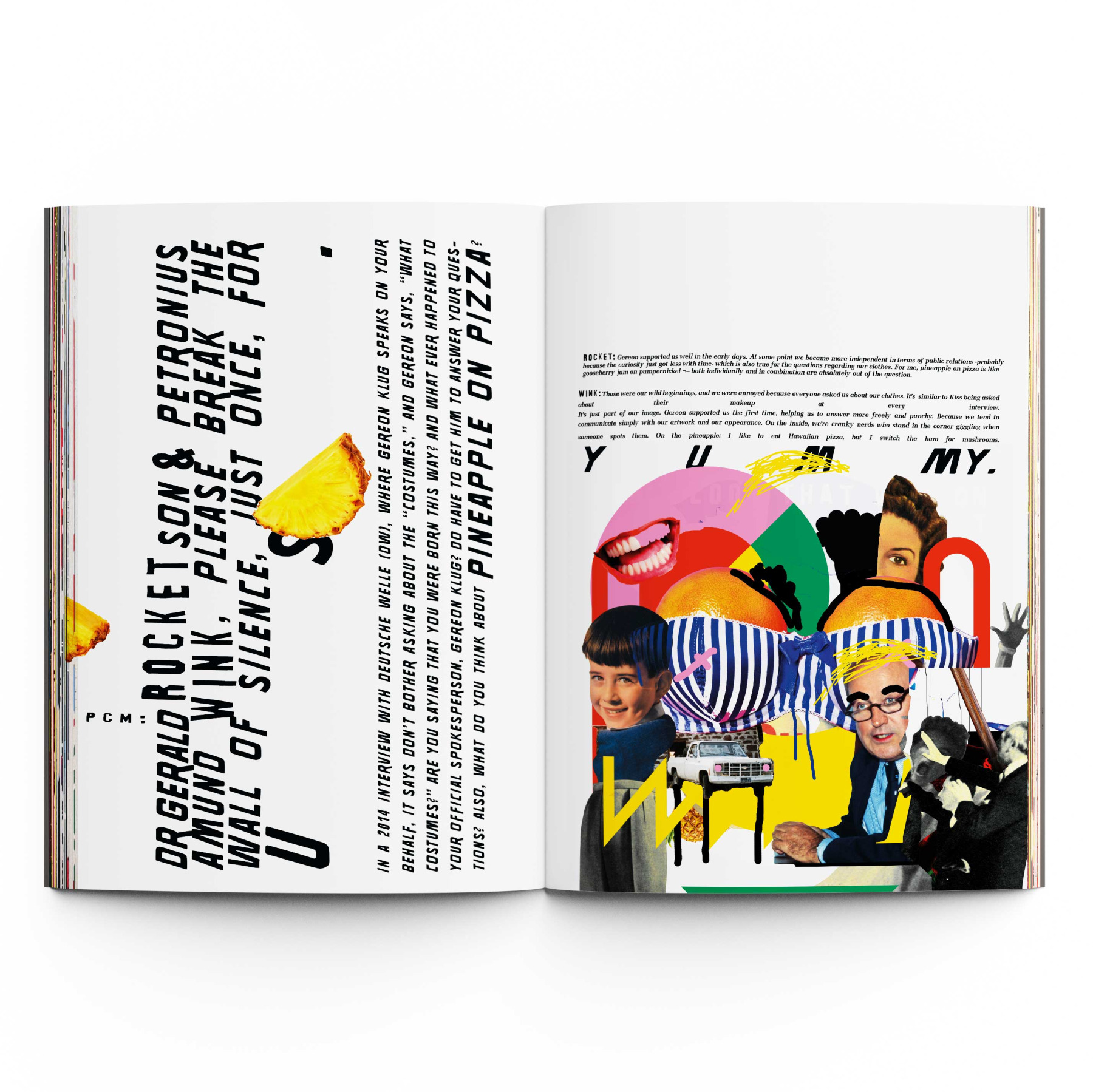
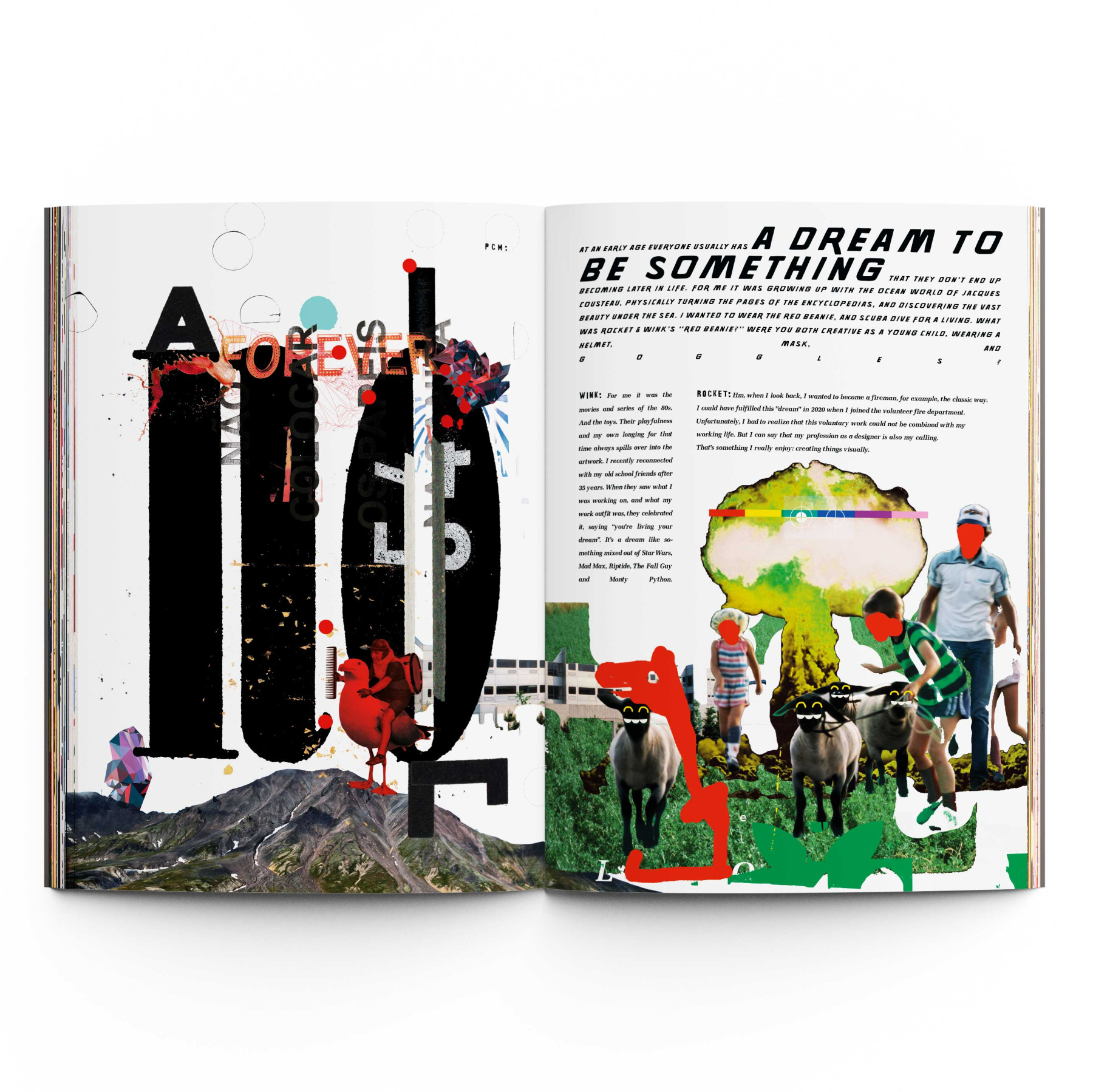
For Plastikcomb N°6, we got to visualize our own interview feature—as an editorial built on the collision of type and image. Plastikcomb keeps that wild 90s typographic spirit alive, somewhere between Raygun and David Carson: raw, bold, and happily a little hard to “read” (in the best way).
So our job wasn’t to make it pretty—it was to treat typography like imagery: words as shapes, rhythm over rules, layout as attitude. For us, it was a small dream come true—because we’ve been fans from day one, and this one wasn’t about building our brand. It was purely for the love of it.
So our job wasn’t to make it pretty—it was to treat typography like imagery: words as shapes, rhythm over rules, layout as attitude. For us, it was a small dream come true—because we’ve been fans from day one, and this one wasn’t about building our brand. It was purely for the love of it.
Plastikcomb N°6. Interview Editorial.
MORE STUFF
Loading...